COURSE 4 • Lesson 3
Motivating your team with data
You’ve tracked data. Great. But now what? The highest performing companies use data to drive transparency, motivation, and creative problem-solving from their teammates.
COURSE 4 • Lesson 3
You’ve tracked data. Great. But now what? The highest performing companies use data to drive transparency, motivation, and creative problem-solving from their teammates.
Once you have your data tracking set up, your tracking plan enforced, and your tools connected, each individual team will be in a good place to drive forward their own metrics. The product team can analyze where the biggest drop-offs are for activation, and build tests to improve them. The marketing team can launch behavior-based drip campaigns and measure the results of their advertising.
But, don't miss the opportunity to motivate your entire team and company using data. Data is empirical. It tells us exactly how we're doing. It has the power to drive cohesion and alignment if we're transparent about it and let everyone else know how we're doing. That's why we think data is one of the most powerful ways to motivate your company to do more and to do the right things.
Here are three ways we use data at Segment to get our team pumped up about hitting our goals and serving our customers better.
If you read enough startup blogs, you'll find the "hockey stick" growth curve is ubiquitous. We all know that any startup that IPOed had some version of this growth trajectory, and most of us also know that it's incredibly difficult to achieve.
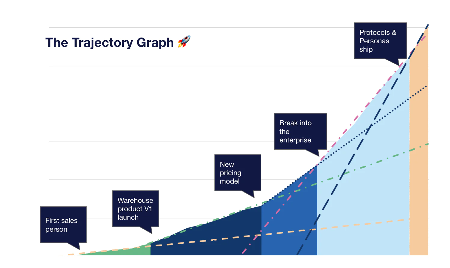
To give our team more motivation to hit this champion status, we took a look at our revenue growth graph. At each axis where the growth curve tilted upwards, we noted two things: 1) We identified the key changes in the company that contributed to that growth step-change 2) We drew out what our company trajectory would look like in the future if we never reached another step-change.

When we looked into a few of these key moments, we got really excited because we believed there were more we could create! Today, we use this graph as an opportunity for motivating our team. Every quarter, our founders get up in front of the company and showcase the latest graph during all hands. They entertain what current projects might drive our next step change and challenge the company to innovate to find our next ticket to the hockey game.
What's amazing about this kind of a graph is that it makes everyone who was a part of these projects in any way, or was even just at the company during that time, feel like they directly contributed to our exponential growth. It also gives the team hope that we can continue to innovate and increase this slope. Lastly, the Trajectory Graph reminds us that we can never rest on our laurels, or else we won't reach the ever elusive hockey stick curve.
At Segment, we're very transparent with our employees about how we're doing. We find this breeds more trust and motivation if anyone can look up exactly how much revenue we're making and from which market segments.
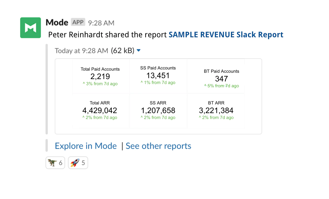
We don't just allow people to find it, we actually push the information to them on a weekly basis in our #shipped channel in Slack. (This is easily repeated in any shared forum your team has to communicate.) Here's a doctored example for you to take a look at:

Every week we share our key metrics in totals and percent growth for our account types (Total Paid, Self-service Paid, Business Tier Paid) and annual recurring revenue (Total ARR, Self-service ARR, Business Tier ARR).
This means everyone knows exactly how far we have to hit our goals and what areas of the business are doing well (or not).
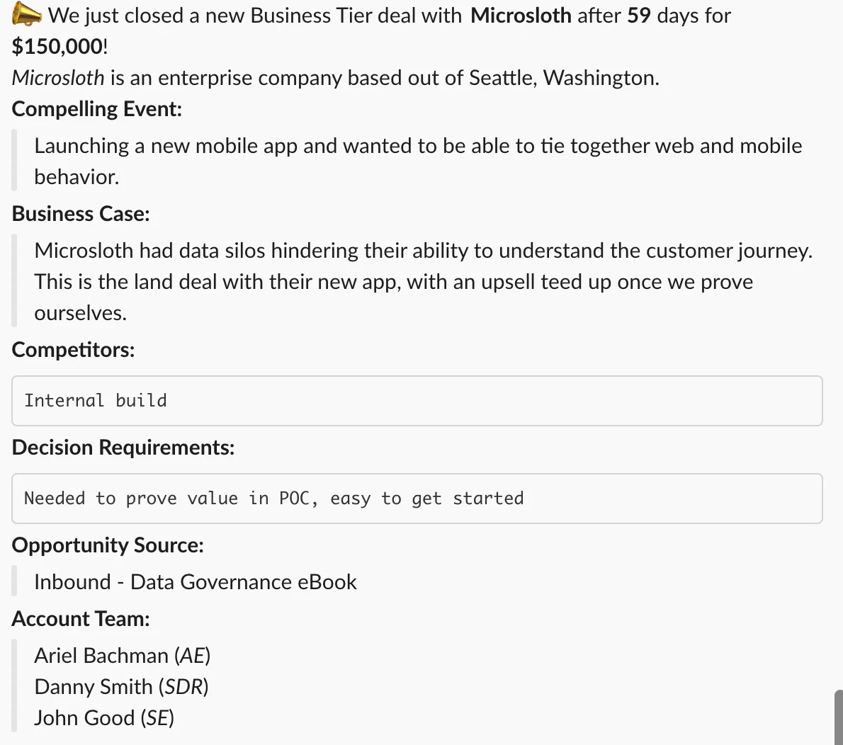
We also set up a bot to post every Closed Won deal from Salesforce into the #shipped channel. This gets the whole team (engineers, product managers, accountants, everyone!) to see that we're gaining traction, learn what types of companies we're resonating with, and what their use cases are. Here's an example:

Especially as we reach the end of a quarter, the whole company rallies around refreshing the shipped page to see how the deals are rolling in and how close we are to hitting our goals. We also celebrate the people across the team that helped make these happen, from success to sales to product and engineering. Emojis abound!
Many new teammates comment on how previous companies never shared this type of information and how they appreciate being treated like a respected and vital member of the team with this kind of transparency.
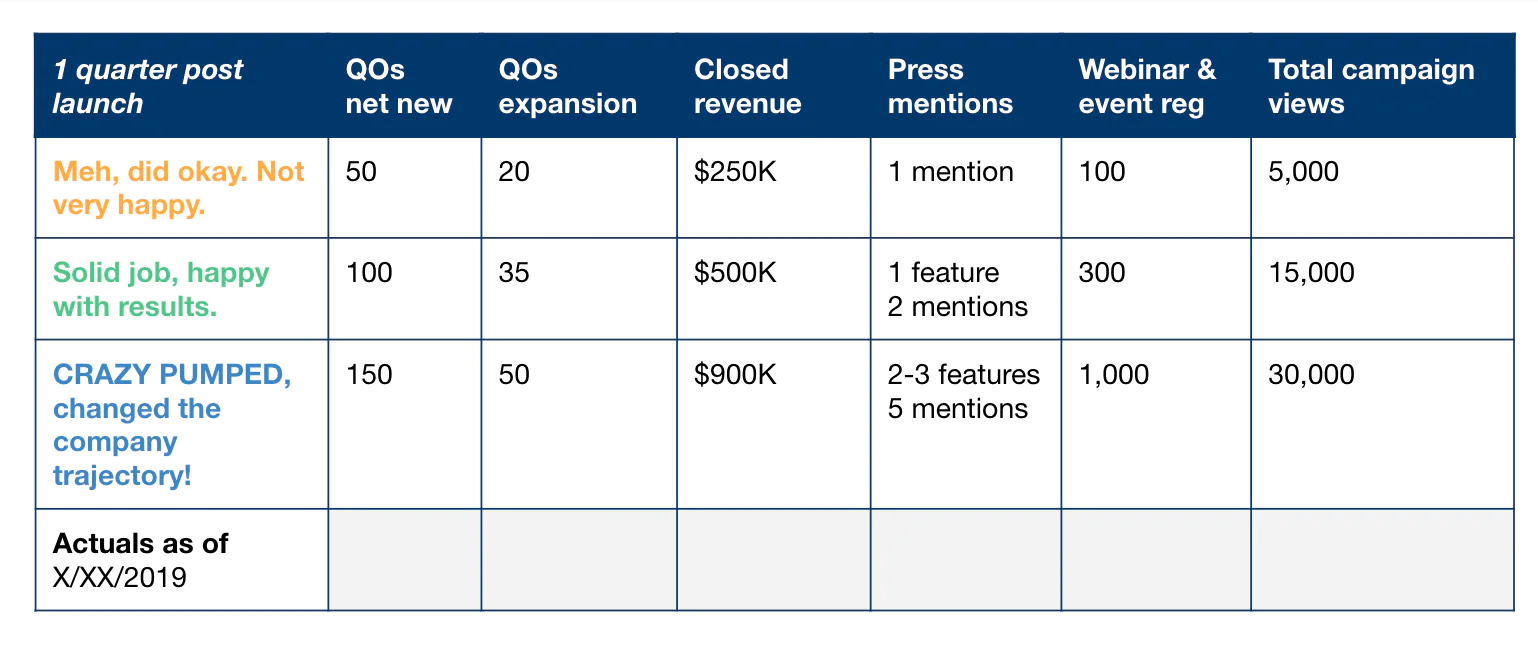
Our last tactic to share with you is setting very clear "buckets" of goals. This means clarifying BEFORE you launch what results you're going to be happy with, not so excited, and ridiculously amazed by.
Usually, we put the green "solid job, happy with our results" in our OKRs. That's what we're really trying to target and is the single most important metric you're trying to drive with a launch (usually revenue or sign-ups).
But that one number doesn't give you a lot of context on the leading indicators that drive the core metric and what is a miss vs. a runaway success.

Here is an example of how to set up your metrics for a SaaS launch that is sold through a sales team. (A QO is a qualified sales opportunity.)
Having these buckets defined is really motivating for our team to know exactly how well we are trending towards success and to encourage us to dig into learnings if things are not going as well as we'd originally hoped.
We'd recommend using baselines and past performance to set your goal buckets. If you don't have any, that's okay, too! You can create a table with your initial guesses best. Once you do launch, you can re-adjust your expectations—what was right and what was wildly off? Now you have your baseline for the next launch (of course adjusting for the scope of the launch, audience, pricing, etc).
How do you motivate your team with data? Let us know on Twitter!
Building a data driven company
Enter your email below and we’ll send lessons directly to you so you can learn at your own pace.