COURSE 1 • Lesson 4
Measuring product-market fit
In this lesson, you'll learn how to use analytics to quantify product-market fit. As we learned the hard way, this knowledge can save you years of time and hundreds of thousands of dollars.
COURSE 1 • Lesson 4
In this lesson, you'll learn how to use analytics to quantify product-market fit. As we learned the hard way, this knowledge can save you years of time and hundreds of thousands of dollars.
Product-market fit happens when a market buys the product you’ve built. All products and features need to find product-market fit in order to survive. This seems simple enough. Surely people know how to do this reliably? Surely Silicon Valley, startup accelerators, and business schools must have a repeatable method for building products that a market wants to buy? Nope. The reality is not so pretty.
My co-founders Peter, Calvin, Ian and I started building ClassMetric together in May 2011. At the time, we were students at MIT and RISD. Our product idea was a classroom lecture tool: we’d give students a button to push to say “I’m confused” anonymously, and the professor would get real-time feedback about how their lecture was going.
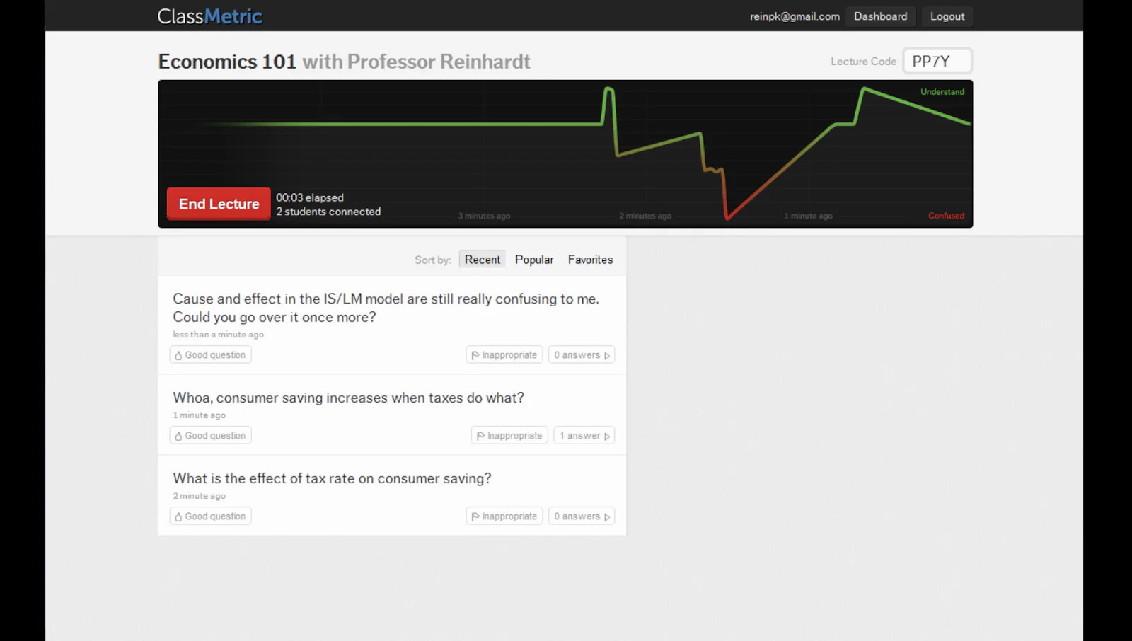
We were incredibly excited about this idea as students, and a few professors we talked to were eager to give it a try.

Strategically, we thought it was a clever way to disrupt Blackboard, the monolithic Learning Management System used by many universities. Investors got excited about it too. In May 2011, we got accepted into the startup incubator Y Combinator. Here’s a photo of the early ClassMetric team working together:

As the fall semester spun up, we deployed our classroom lecture tool into these 20 classrooms at various universities around Boston and Cambridge. It was a complete and utter disaster.
As soon as the students opened their laptops, 60 percent of them went straight to Facebook. By the end of each class, the proportion of students using Facebook rose to 80 percent at any given moment. And while the typical classroom might have one or two students using laptops, we had convinced these professors to ask every single student to use their laptops. Our app accidentally created the most distracting lecture environment of all time. It was horrifying. Professors were livid. Our embarrassment was complete.

In our “dark years,” my co-founders and I did not use analytics to quantify product-market fit. We had deluded ourselves that our customers loved our products. Five pivots, two years, and hundreds of thousands of dollars later, we had nothing to show for it. The culmination was a very memorable Y-Combinator office hour with Paul Graham when he looked at us dead on and said, “So you burned $500,000, and you’re back to square one?”
Eighty percent of all startups fail to achieve any kind of product-market fit. In the United States alone, at least 3,000 companies receive seed funding each year, raising over $6 billion in capital per year. Many thousands more are started without venture capital, or within the walls of an enterprise innovation lab. But even after years of gut-wrenching effort from the founders, early team, and investors, the hard truth is that 80 percent—many thousands—of those startups fail to achieve even the first, most-basic step in company-building.
These startups do usually build a product. But they fail to build one that a market wants to buy.
Today we’re going to discuss how to use analytics to quantify product-market fit in a way that it is impossible to delude yourself.
Retention cohorts are the most important metric to measure product-market fit. Retention cohorts show whether the same cohort of users comes back week over week to derive value from your new product.
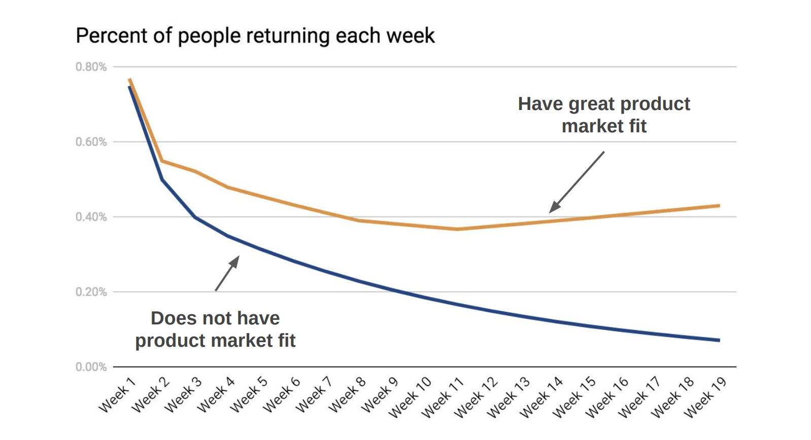
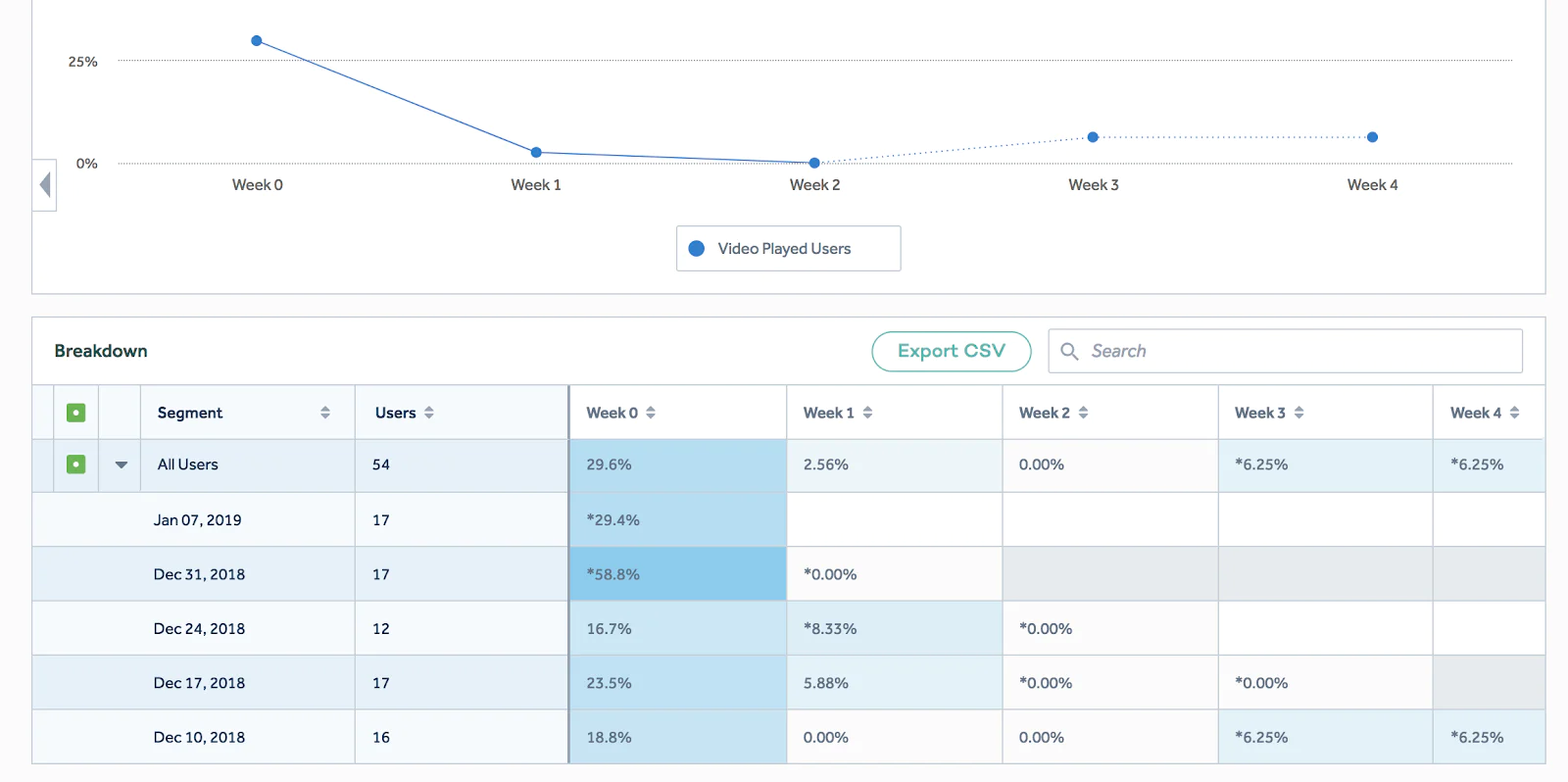
The graph shows the percentage of users that performed an engagement event (such as “watched at least one video”). A cohort of users is tracked from their signup week (week one) and every week following. A product with product-market fit will show users that stick around week over week, and often even increase in retention. A product with no product-market fit will trend toward zero percent of the cohort returning week over week.
The trick is choosing a metric that accurately represents value people get from the product and a frequency within which we expect that value to be used. Let's go through a few real-world examples.

AirBnB looks to optimize the number of annual bookings per user. Facebook famously looks at monthly active users, and eBay looks at weekly gross merchandise value per user.
Now, let’s compare the retention cohorts for two public companies, Netflix and Blue Apron.
An estimated 37 percent of the world’s internet users use Netflix. Since their transition from DVD-by-mail to subscription video-on-demand in 2007, the company has grown from 23 million subscribers in 2011 to 130 million in 2018. Revenue has followed a similar trend from $1.2 billion to over $11.6 billion in the last 10 years. Netflix’s market capitalization has gone from $1.8 billion to $134 billion in the same time period.
We are all intimately familiar with Netflix and the product-market fit that this company and product commands. Let’s look at their paid retention cohort chart to see if it supports the same conclusion:
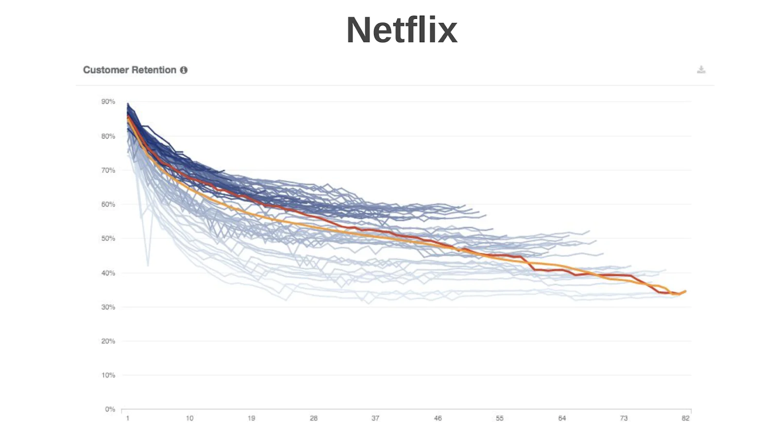
Netflix is able to retain 70 percent of new users after one year, and 30 percent for seven years. Netflix is one of the best mass-consumer retention cohort charts ever.
Blue Apron has, on the other hand, had a tougher go. The company struggles to retain its users, and has seen its market capitalization drop from $1.73 billion (mid-2017) to $0.19 billion (early 2019).
Their paid retention cohort chart shows a weaker product-market fit. BlueApron retains 50 percent of users in the first month and only 10 percent for two years.
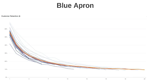
These graphs help show how retention cohorts indicate different levels of product market for public company brands we’re intimately familiar with.
We recommend all products measure their product-market fit. Now let’s figure out how we can do that.
Let’s imagine we’re building a Netflix competitor. Our product’s acquisition-engagement-monetization funnel looks like the following:
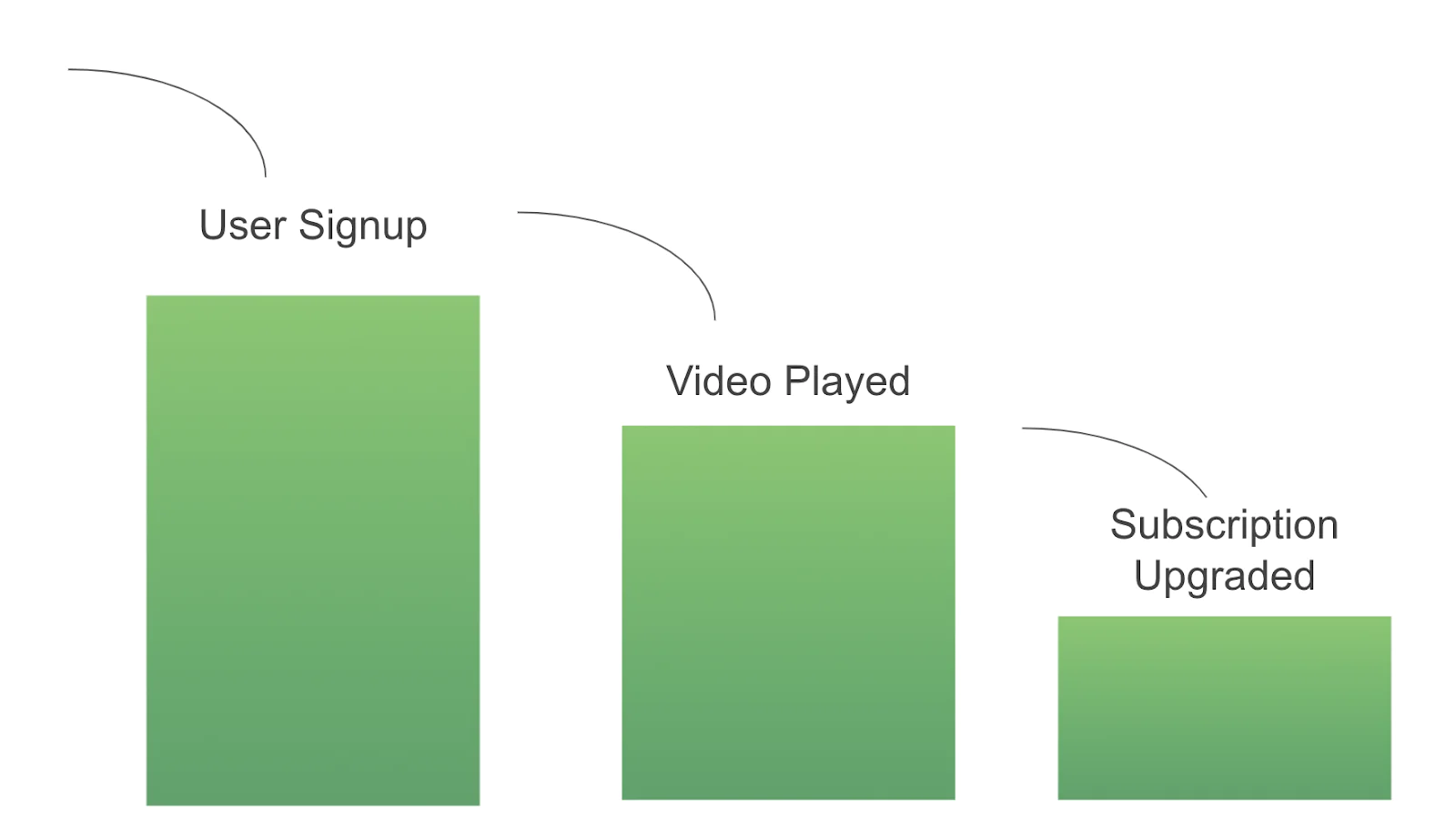
Modeled with Segment’s Analytics API, we can collect the following data points:
An analytics tool like Mixpanel, Heap, or Amplitude is the best way to build your first retention cohort chart. All have retention reporting capabilities. Our example below will show you how to get started with Amplitude’s Retention Analysis feature.
First you’ll want to send your data to Amplitude. You can do this with the flip of a switch in Segment by adding the Amplitude destination to your source.

Next you’ll see data flowing into Amplitude:
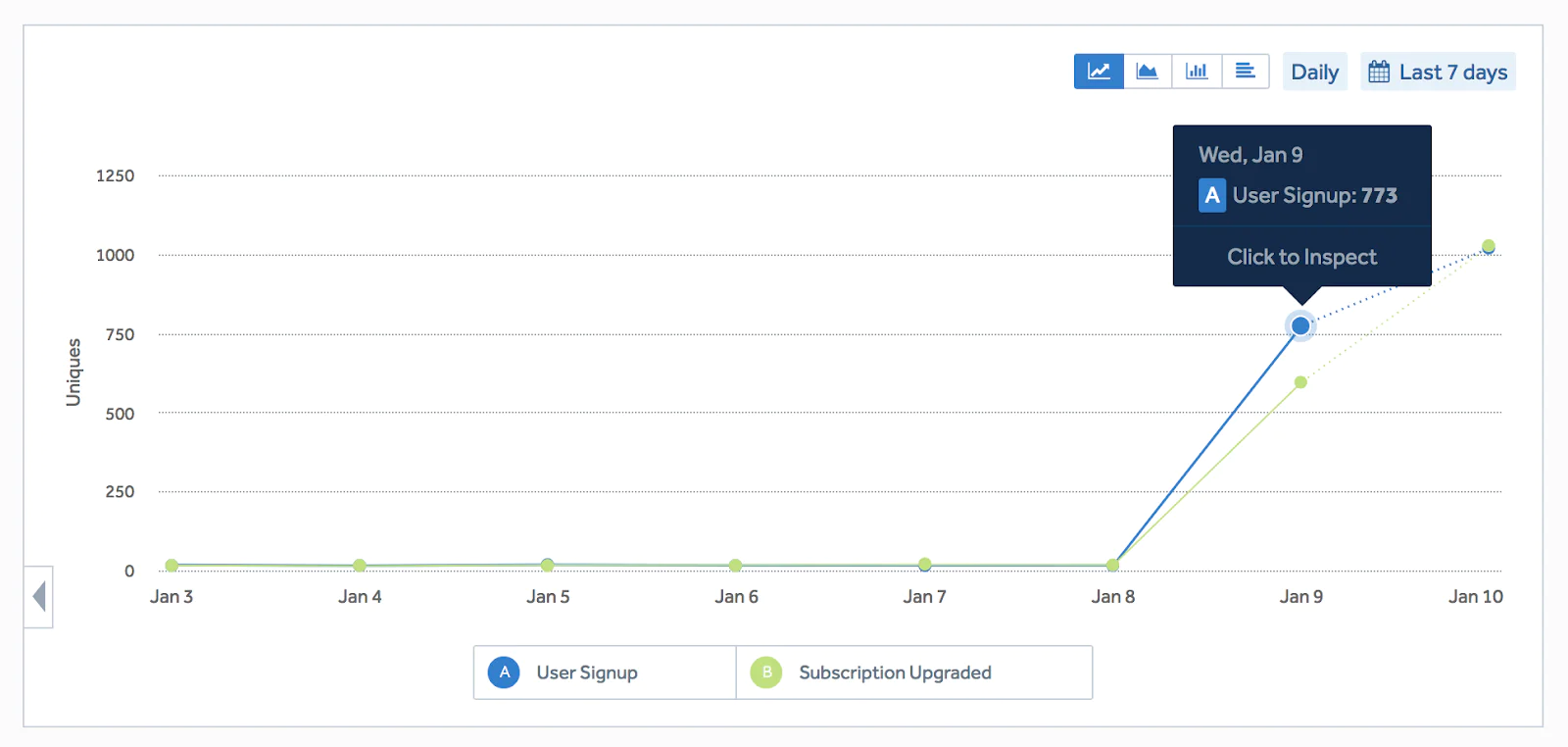
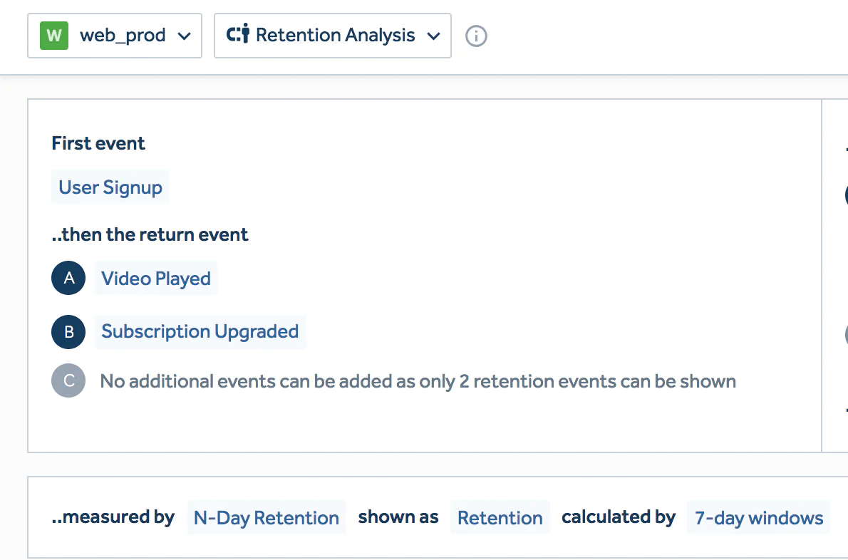
Now it’s time to create a Retention Analysis chart. You’ll select the First Event which causes the user to enter the cohort. Next, you’ll select the Return Events which indicate that the user has engaged during the current retention window. We’ll use User Signup as the first event, and both Video Played and Subscription Upgraded as engagement events.
N-Day-Retention calculated by 7 Day Windows will allow you to measure the percentage of the initial cohort that comes back week over week.
The resulting chart shows week-over-week retention across weekly cohorts.
Over time, your cohort definitions may get more complex. For example, you may need to remove specific time cohorts or have more than two return events. For these cases, you can define retention using SQL and a data warehouse.
At Segment, we use Mode Analytics on top of Amazon Redshift to build our retention cohorts. We distribute a chart that looks like the following in our Monthly Metrics Report:
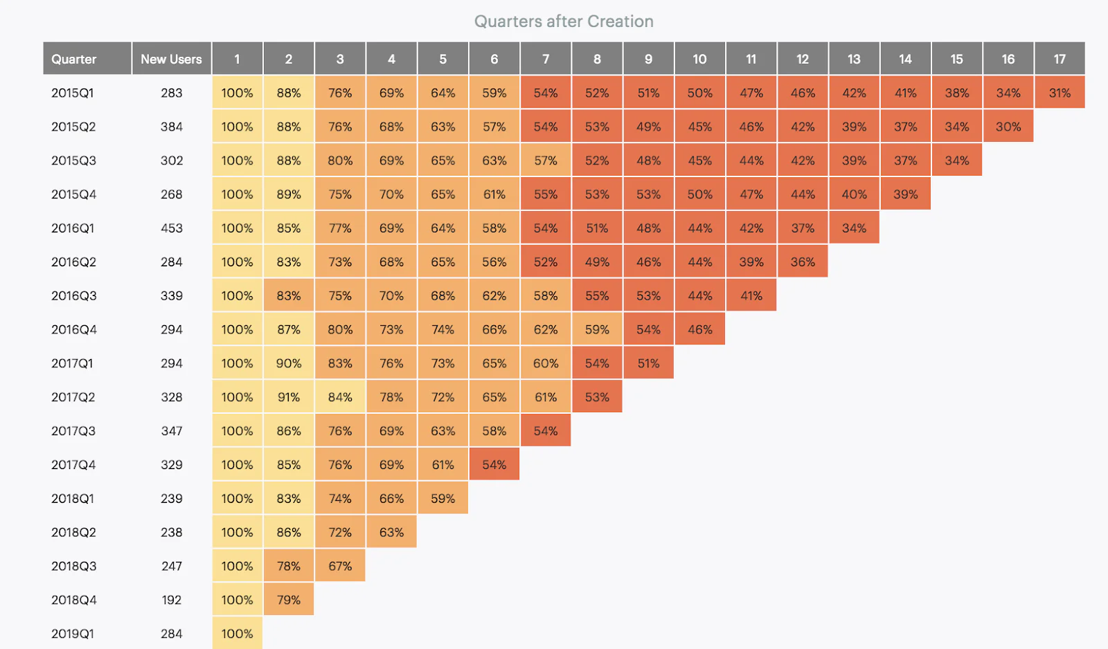
In this chart, each row is a quarterly cohort and each column is a following quarter after the previous cohort creation. SaaS companies should use this type of quarterly retention cohort chart to graph both cohorted revenue retention and cohorted account retention.
If you’re measuring your retention rate, you’re on your way to quantifying product-market fit. Doing so can allow you to systematically test whether your customers stick around and whether your business is ready to scale.
Finding product-market fit is qualitative as it is quantitative. I recommend my co-founder Peter’s talk on the emotional journey of finding product-market fit and the transition from the tough of sorrow to when users start pulling your product from your hands.
Using these two strategies of measuring and feeling, you’re on your way to finding PMF. As we learned the hard way, this knowledge can save you years of time and hundreds of thousands of dollars.
Intro to analytics
Enter your email below and we’ll send lessons directly to you so you can learn at your own pace.