How to execute a seamless app UI refresh
In this post, we’ll be sharing more about the engineering process we followed to build and release the app UI refresh without any interruptions to the customer experience.
By Allen Kleiner
In this post, we’ll be sharing more about the engineering process we followed to build and release the app UI refresh without any interruptions to the customer experience.
Last week we announced a brand new look and feel for the Segment App. You can learn more about what we launched as a part of the app refresh here.
In this post, we’ll be sharing more about the engineering process we followed to build and release the app UI refresh without any interruptions to the customer experience.
Over the past several years, the Segment App has grown in scale and functionality. Simply put, we have more users and more products than ever before. That’s life at a growing startup.
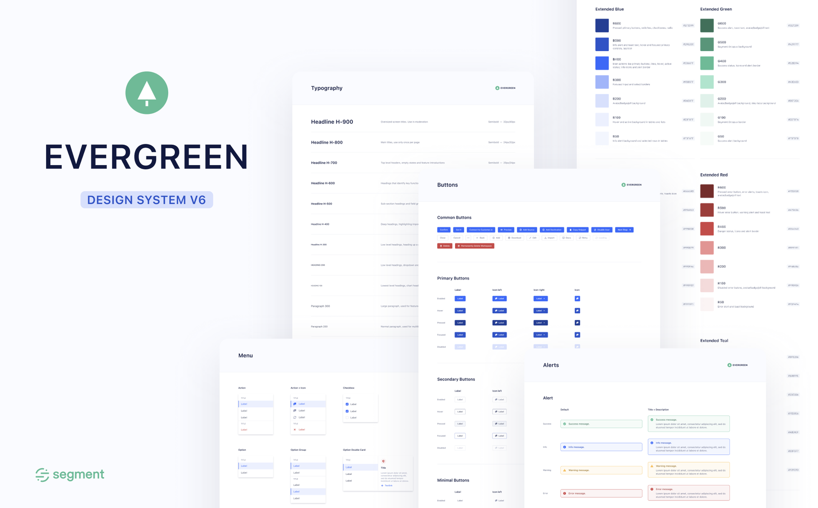
As our app expanded to accommodate new products and use cases, we invested in resources to make building products easier across our entire engineering team. Out of this need to support ever-growing product and design requirements came Evergreen, our open-source, React-based design system.
In essence, Evergreen allowed engineers to write front-end code that looks and feels consistent from a UI perspective. It’s been phenomenal for supporting forward-looking product development. However, as the company scaled and there were more engineers contributing to the Segment App, the components contained in Evergreen were applied in new ways that ended up leading to a disjointed experience.
While the UI building blocks were consistent, the app’s UX started to drift. The Segment App began to mirror the specific organizations that implemented their respective features without strong system-level patterns and abstractions that enforced page guidelines, component usage, and more.
Roughly a year ago, we embarked on an effort to re-skin and modernize our public site https://segment.com. We brought fresh designs and functionality to marketing properties while also making core improvements to page speed and reliability. We realized that now would be a great time to take a good look at our design system to reevaluate how it served us and how it could be applied to deliver a more consistent app experience for all Segment customers.
Evergreen bridges the gap between designers and engineers. It also serves as a perfect starting point for where we should begin implementing the redesign.
For those unaware of what a design system is, it’s a collection of components, styles, and behaviors that implement common UI elements and patterns. Things like Buttons, Tables, Tooltips, Typography, and Menus are all examples of components in a design system.
The first step we took was to re-think and modernize the visual styles in our design system. Together with the design team, we began imagining what our new UI could look like. We came up with a list of updates to the styles, color palette, and component interactions that we wanted to make first. Those updates also aligned more closely with the new brand design used on Segment’s public site.
In order to reap the benefits of the Evergreen updates, we needed to ensure that as much of the app was using standard components and UI. Having the app use non-standard components would increase complexity and make the future rollout a lot more difficult. That was step one.
With a little bit of JavaScript, we were able to quickly visualize which parts of the app were using Evergreen and which were using an outdated UI framework. This gave us a great starting point for bringing technical standardization to the product.
While Evergreen has been instrumental in letting product engineers build products that were very closely aligned to mocks, it inadvertently led to subtle inconsistencies throughout the product. Flows and interactions that should feel and operate in very similar ways didn’t. Things like re-sizing behavior, scroll behavior, and other interactions were drifting across different parts of the app.
In order to improve the velocity of the app refresh, we decided to establish a set of rules—or page guidelines—that would ensure page consistency going forward. This helped formulate the mental model around how a screen should be implemented and provided opportunities for abstraction across every page detail.
It became immediately clear that we needed components like <Page /> and <PageHeader />, which encapsulated the box model and layout logic across the entire app. We similarly centralized a set of constants for the different “sizes” UI flows could have across the app.
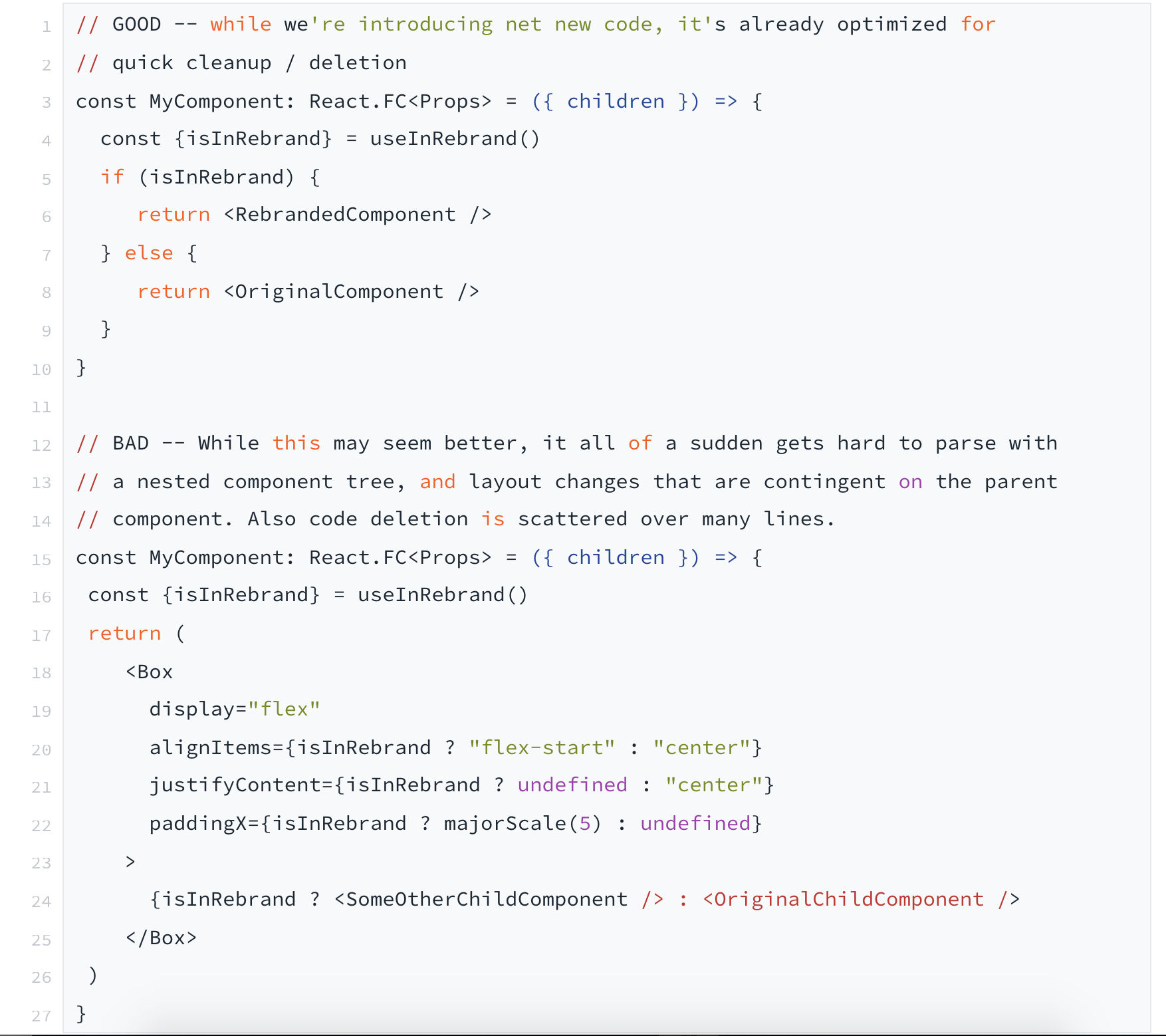
We also created a set of utility components to help bridge the gap in the rebrand and allow us to move more rapidly. For example, one of the biggest visual changes of this UI refresh was a departure from a “card” layout to a “cardless” one. In practice, this meant removing the elevation (a CSS box-shadow) property from Evergreen’s <Card /> component.
In order to minimize code churn, we decided to create a super simple <RebrandCard /> that conditionally swallowed the elevation property if we were in the app UI refresh. It looked something like this:
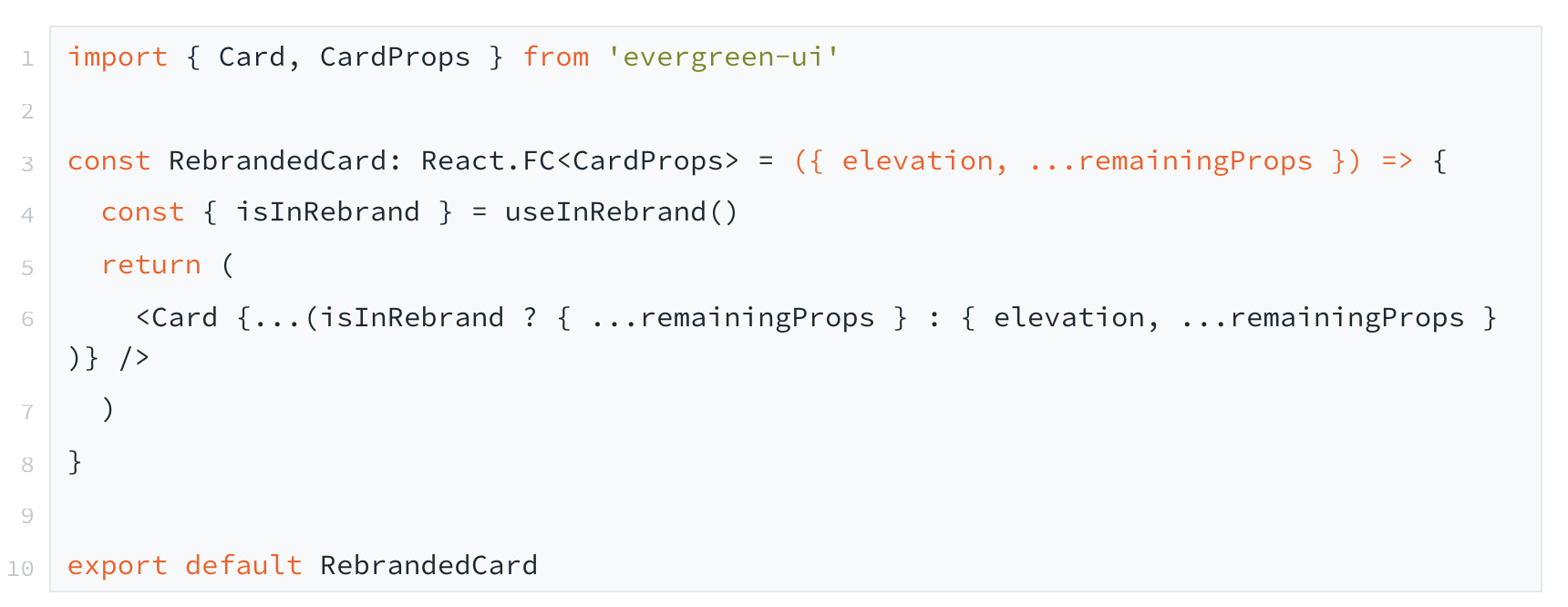
Now a change to “flattening” a UI and making it more in-line with the redesign was a matter of going from import { Card } from 'evergreen-ui' to import { Card } from 'components/RebrandedCard'.
While impossible to scrap all of our UI code in the time frame that we were given (< 3 months), these abstractions and standardizations helped us move quickly towards a common goal for our customers—UI and UX consistency.
A redesign of this size combined with a lean and centralized engineering team required working with different product teams to ensure all potential UI states were supported appropriately. We found several tactics to be helpful here:
Establish a “rebrand context” using React’s context API
Our biggest priority with the rebrand was to ensure that there was no impact on customer workflows. We needed to be able to gate changes so that we could ship pieces of the rebrand incrementally behind a flag. This was important to keep PR reviews concise and focused.
We leveraged React’s context API to build the idea of a “rebrand context,” which could be used across our entire workspace. We fetched whether the flag was “on” or “off” for a particular workspace and made that available at our top-most context provider.
In order to account for function components (where we could take advantage of hooks) and legacy class components, we decided to build small helpers that let us thread those context values through. We ended up having two ways to quickly access the rebranded context value:
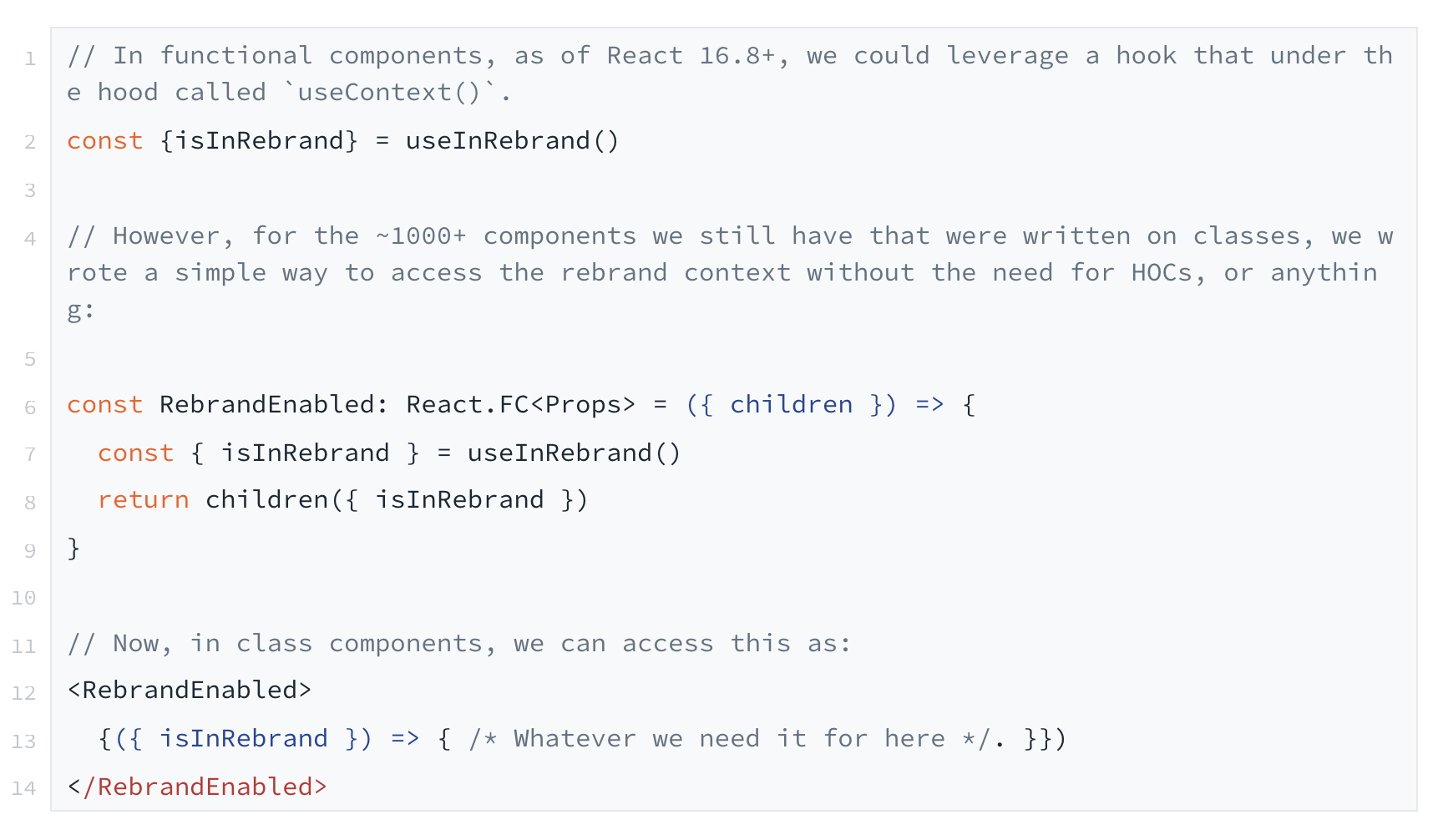
This gave us full flexibility with just a few lines of code to access the rebrand value across thousands of React components that make up our app.
Deploy internally and QA often
One of the best parts about working on the Segment App is how lightning-fast our feedback cycles are. We have continuous deployments, ~3 minute build times, and the ability to deploy a custom ad-hoc internal staging environment. That enabled us to be able to share custom staging environment links with other engineers, designers, and product folks from the pillar that showed exactly what changes were happening to our codebase.
From there, they could leave feedback and point out any edge cases that had not been accounted for. And, we could make fast iterations all within the same PR cycle. Once the PR is landed, then the commit would build and deploy to our primary staging environment and our production environment at the same time.
This allowed us to move quickly, stacking PRs against each other in a manner that let other engineers get full control and visibility over the work that was going on and how it was progressing for their respective product areas.
Develop and present the rebrand in a consistent way
It was important for us to communicate the app refresh clearly and consistently to the broader team. We found three tactics to be helpful in reducing the mental overhead associated with trying to scan and parse through the UI changes taking place:
1. Preferring additive changes. In order to optimize for code deletion, we ensured other engineers that our changes would be additive. This way, they were already optimized for code deletion and we had full safety of a rebranded UI flow behind a feature flag.
2. Prefer explicit returns for components. A handy feature of JavaScript is the ability for arrow functions (like React function components) to have an implicit return. We had quite a bit of our component code leveraging this but quickly realized that we needed to make a lot of these components context-aware for their design changes. In order to minimize git diff churn going forward, we plan on being explicit about our returns so future PRs are scoped to the changeset accordingly.
3. Encourage turning off whitespace for code reviews. A small detail piggy-backing off the above point. Whitespace can make code reviews super noisy and hard to follow, especially as a reviewer. We encouraged our team to turn off whitespace for code reviews in order to keep them focused on the actual changeset. (Pro tip: GitHub has a super handy ?w=1 query param you can append to the end of PR links to remove any whitespace changes.)
As we started to make considerable progress on the rebrand, we realized that we needed both a place to share feedback and a way for any internal employee to toggle the rebranded UI on and off for their workspace.
We started an #app-refresh-feedback Slack channel to centralize all discussions about the UX decisions. This became vital for our team, not just from a visibility perspective, but as a way to surface feedback and bugs. It was also a great way to surface customer pain points from our GTM team who had a clear sense of our customer’s needs.
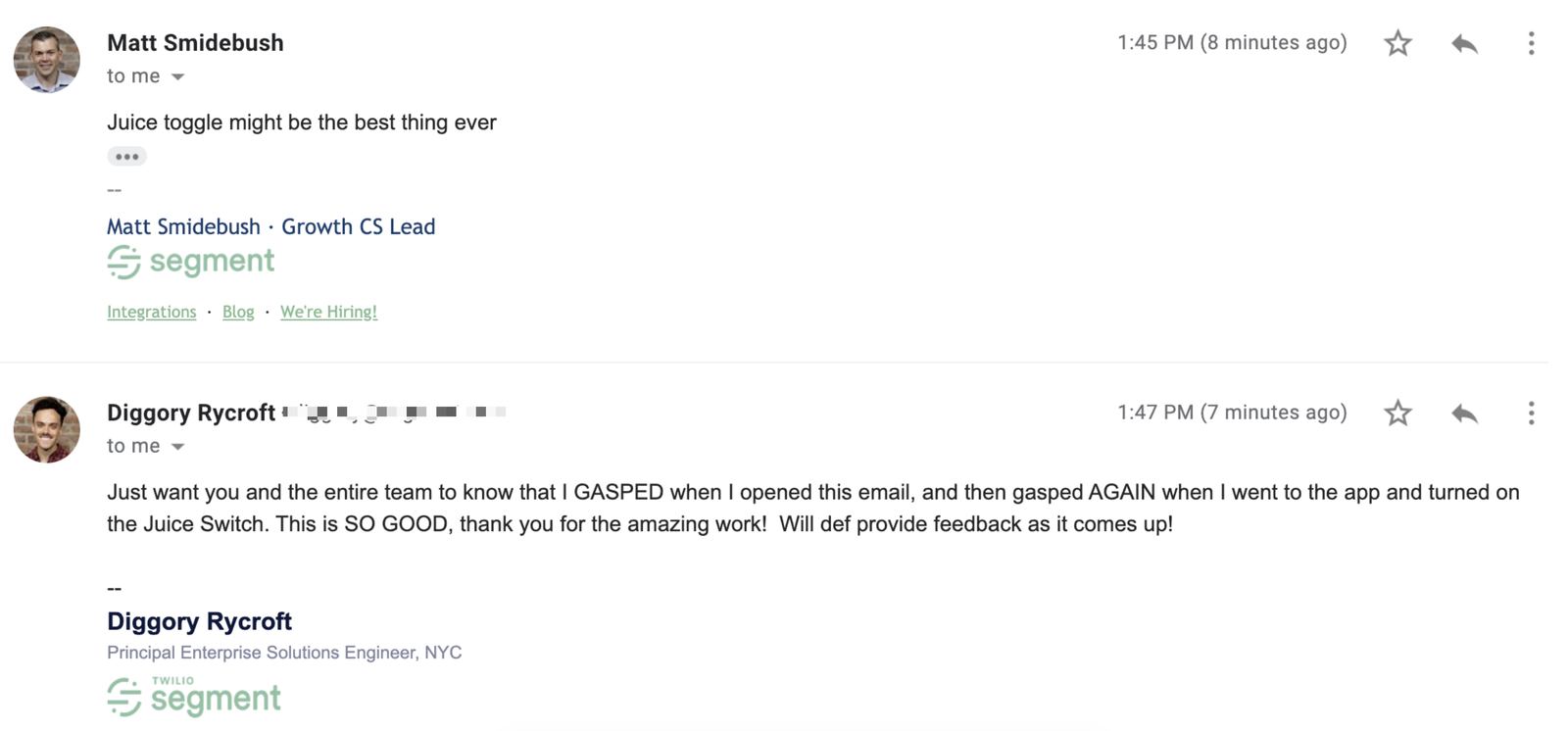
We also decided to have some fun with the internal launch. To make it easy for any user within the company to toggle the rebrand on/off, we implemented a toggle that could turn on and off the new UI. All of our hard work culminated with a simple switch, which we affectionately named the "juice" toggle.
The internal reaction to the app UI refresh (and the “juice” toggle) was outstanding. By having a little bit of fun with the internal release, we started to drum up excitement and feedback from folks across the company of things that they’d love to see in the app.
This is just the beginning of our journey with refreshed UI components for the Segment App. The feedback from our designers, engineers, and go-to-market stakeholders has all been resoundingly positive, and we can’t wait to hear what you all think about the new branding, too.
This project could not have been possible without the immense effort from a lot of different people, not limited to Hareem Mannan, Kate Hsiao, Dylan Kim, Matt Shwery, Colin Lohner, Max Luster, Kevin Tu, Vadim Demedes, and many more people throughout our Engineering, Product, Design, Marketing, and Security teams.

Our annual look at how attitudes, preferences, and experiences with personalization have evolved over the past year.