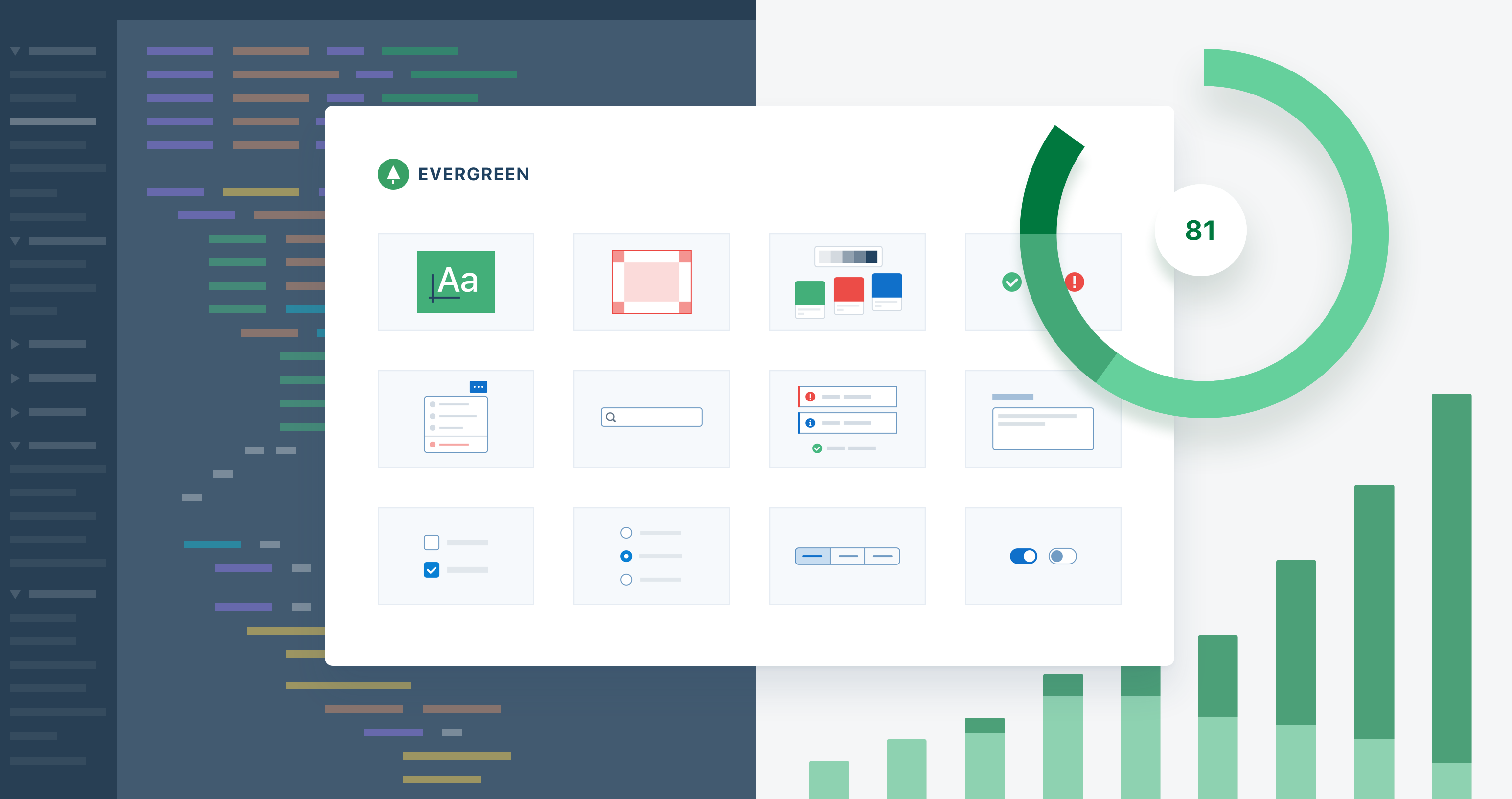
Design systems are emerging as a vital tool for product design at scale. These systems are collections of components, styles, and processes to help teams design and build consistent user experiences. It seems like everyone is building one, but there is no playbook on how to take it from the first button to a production-ready system adopted across an organization. Much of the advice and examples out there are for teams that seem to have already figured it out.
Today I want to share my experience in bootstrapping a design system and driving adoption within our organization, Segment. I will share how we got started by creating something small and useful first. Then I will share how I hijacked a project to build out that small thing into our full blown design system known as Evergreen. Finally, I will share how we continue to drive and track adoption of our design system.
What is a Design System?
A design system is a collection of components, styles and processes to help teams design and build consistent user experiences — faster and better. Design systems often contain components such as buttons, popovers and checkboxes, and foundational styles such as typography and colors. Teams that use the design system can focus on what’s unique to their product instead of reinventing common UI components.
What’s in our Design System
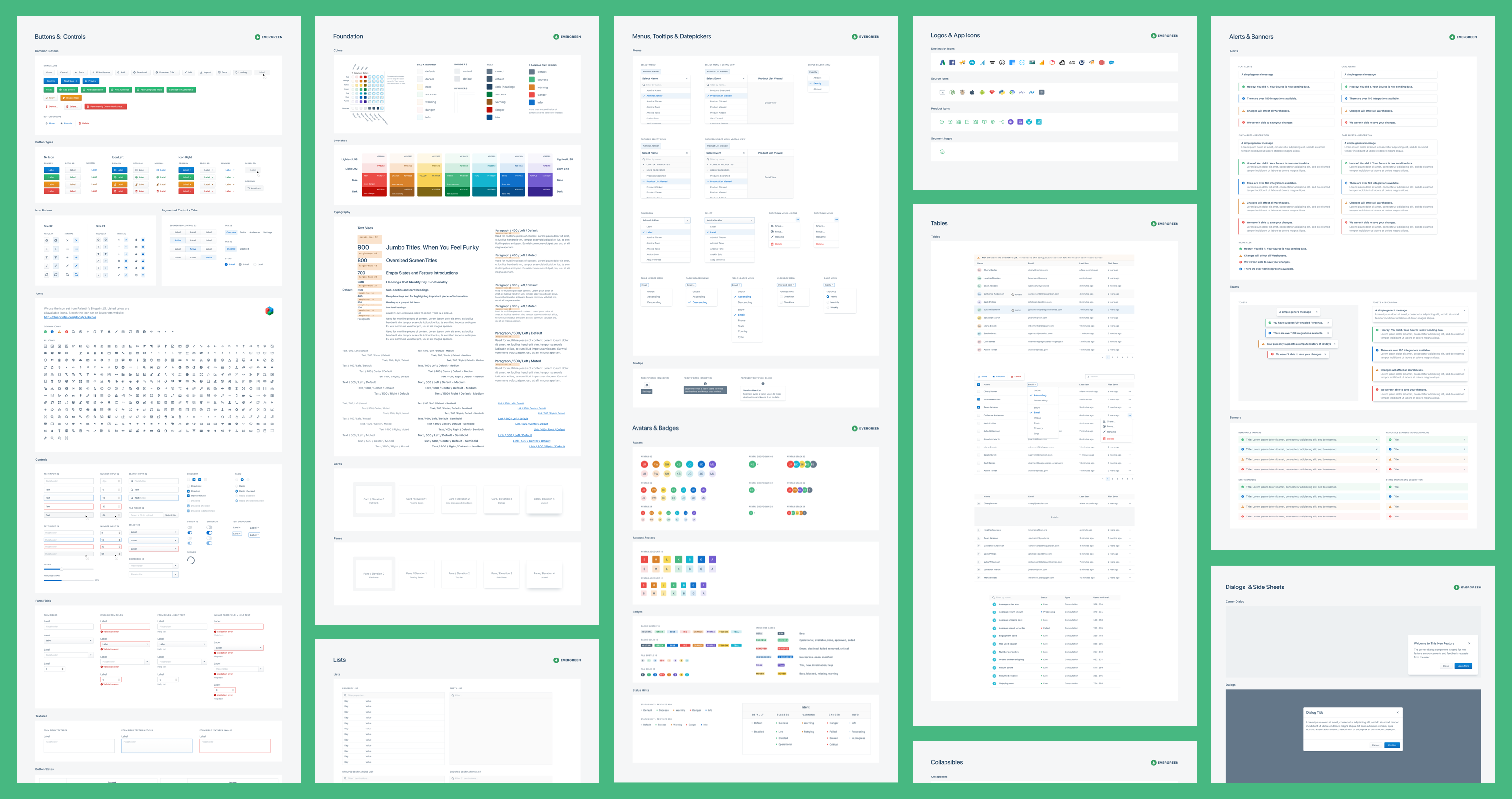
Before I share my experience bootstrapping our design system called Evergreen. I want to set some context first, and explain what is in our design system.
-
Design Resources
-
Sketch UI Kit
-
Design Guidelines
-
-
Code Resources
-
React UI Framework
-
Developer Documentation
-
-
Operational Resources
-
Roadmap documents
-
On-boarding process
-
Our design system didn’t start out with all of those resources. In fact, I built something small and useful first. In the next sections I will share the lessons I learned in bootstrapping a design system and driving adoption within our organization.
How We Got Started
About 2 years ago, I joined Segment as a product designer. I worked as a front-end developer in the past and I wanted to use my skillset to create interactive prototypes. To give you a bit of context, the Segment application allows our customers to collect data from your website or app, synthesize that data and integrate with over 200 integrations for marketing and analytics.
The prototypes I wanted to develop would live outside of our Segment application and would have no access to the application codebase. This means that I didn’t have access to the components already in the application — I had to create everything from scratch.
Most advice online talks about starting with a UI audit or trying to get executive buy-in. Those are all part of the long journey of creating a successful design system, but there are many ways to get started. If you set out to solve all of the problems in your product, you might be taking on too much at once. Instead, build something small and useful, provide value quickly, and iterate on what works.
Build something small and useful
One of the first challenges you run into when creating a component library is how to deal with styling and CSS. There are a few different ways to deal with this:
-
Traditional CSS: Verbose to write, hard to maintain at scale. Often relies on conventions.
-
CSS Preprocessor such as Sass or Less: Easier way to write CSS, chance of naming collisions. Often relies on conventions.
-
CSS-in-JS solutions: Write CSS in JavaScript. Powerful ways to abstract into components.
I wanted a solution that didn’t require any extra build steps or extra imports when using the component library. CSS-in-JS made this very easy. You can import a component in your code and it works out of the box.
I wanted to avoid having to create a ton of utility class names to override simple CSS properties on components such as dimensions, position and spacing. It turns out there is a way to achieve this in an elegant way — enter the React UI primitive.
Choosing React
There are many choices of frameworks for your component library. When I started building a component library, we were already using React, so it was the obvious choice.
React UI Primitive
After doing research, I found the concept of UI primitives. Instead of dealing with CSS directly, you deal with the properties on a React component. I bounced ideas off my coworkers and got excited about what this would mean. In the end we built UI-BOX.
UI-BOX
UI-BOX exports a single Box component that allows you to use React props for CSS properties. Instead of creating a class name, you pass the property to the Box component directly:
Why is this Box component useful?
The Box component is useful because it helps with 3 common use cases
-
Create layouts without helper classes.
-
Define components without worrying about CSS.
-
Override single properties when using components.
Create layouts without helper classes.
Define components without worrying about CSS
Override single properties when using components
Flexibility and composability
The Box component makes it easy to start writing new components that allows setting margin properties directly to the component. For example, quickly space out two buttons by adding marginRight={10} to the left button. Also, you can override CSS properties without adding new distinct properties to the component. For example, this is useful when full-width button is needed, or want to remove the border-radius on one side of a button. Furthermore, layouts can be created instantly by using the Box component directly.
Still a place for CSS
It is important to note that UI-BOX only solves some of the problems. A class is still needed to control the appearance of a component. For example, a button can add dimensions and spacing with UI-BOX, but a class defines the appearance: background color, box shadows, color as well as the hover, active and focus states. In our design system called Evergreen a CSS-in-JS library called Glamor is used to create appearance classes.
Why it drove adoption of Evergreen
A design system can start with something small and useful. In our case it was using a UI primitive that abstracted away dealing with CSS directly. Roland, one of our lead engineers said the following about UI-BOX.
UI-BOX really drove adoption of Evergreen…
…there is no need to consider every configuration when defining a new component. And no need to wrap components in divs for spacing.
— Roland Warmerdam, Lead Software Engineer, Segment
The lesson learned here is that it’s possible to start with something small and slowly grow that out to a full fledged design system. Don’t think you have time for that? Read the next section for some ideas.
How we started driving adoption
Up until now, I had built a tool for myself in my spare time, but it was still very much a side project. Smaller startups often can’t prioritize a design system as it doesn’t always directly align with business value. I will share how I hijacked a project, scaled out the system, and finally focused on accessibility to drive adoption across teams at Segment — and how you can do the same.
Hijack a project
About a year ago I switched teams within Segment. I joined a small team called Personas, which was almost like a small startup within Segment. With Personas we were building user profiles and audience capabilities on top of the Segment platform. It turned out to be a perfect opportunity to build out more of the design system.
Deadline in sight — our first user conference
The company wanted to announce the Personas product at our first ever user conference, with only 3 months of lead time to prepare. The idea was that our CEO and Head of Product would demo it on stage. However, there was no way we could finish a fully-baked consumer-facing product in time. We were pivoting too often based on customer feedback.
The company wanted to announce this product at our first ever user conference, with only 3 months of lead time to prepare.
Seize the opportunity
It seemed like an impossible deadline. Then it hit me: We could build a standalone prototype to power the on-stage demo. This prototype would be powered by fake data and only support just the functionality that was part of the demo.
This prototype would live outside of the confines of our application. This would allow us to build things quickly, but the downside is that there is no access to the code and components that live in our application codebase. Every component we want to use in the prototype needs to be built — a perfect opportunity to build out more of the design system. We decided it would be the lowest risk, highest reward option for us to pursue.
While we worked on the demo script for the on-stage demo, I was crunching away on the prototype and Evergreen. Having the prototype available and easily shareable made it easier for the team to practice and fine-tune the script. It was a great time at Segment; I could see our team and company growing closer while readying for launch.
Huge Success
The interactive prototype was a huge success. It helped us show the vision of what our product and Personas could be. It drove considerable interest to our newest product, Personas. I was happy, because not only did we have a interactive prototype, we also have the first parts of our design system.
Focus on the developer experience
So far, we built something small and useful and hijacked a project that allowed us to build out a big chunk of our design system, Evergreen. The prototype also proved to be a great way to drive adoption of Evergreen in our application. Our developers simply took code from the prototype and ported it over in our application.
At that point, Evergreen components were adopted in over 200 source code files. Our team was happy about the components, but there were some pain points with the way Evergreen was structured. When we started building Evergreen, we copied some of the architecture decisions of bigger design systems. That turned out to be a mistake. It slowed us down.
Too early for a mono-repo
When I started building Evergreen I took a lot of inspiration from Atlassian’s AtlasKit. It is one of the most mature and comprehensive enterprise design systems out there. We used the same mono-repo architecture for Evergreen, but it turns out there is quite a lot of overhead to when using a mono-repo.
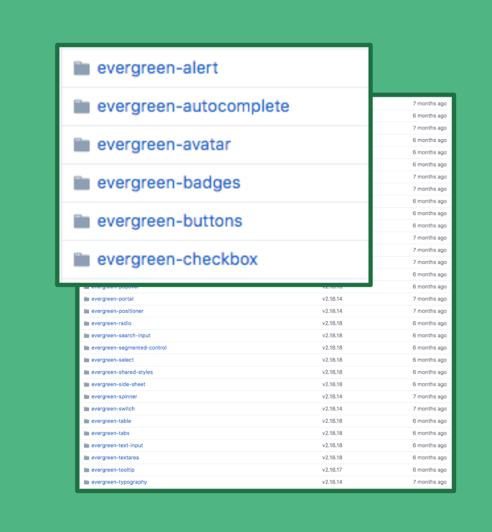
Our developers were not happy with the large number of different imports in each file. There were over 20 different package dependencies. Maintaining these dependencies was painful. Besides unhappy developers, it was time-consuming to add new components.
A single dependency is better for us (for now)
I wanted to remove as much friction for our developers using Evergreen as possible, which is why I wanted to migrate away from the mono-repo. Instead, a single package would export all of our components as a single dependency.
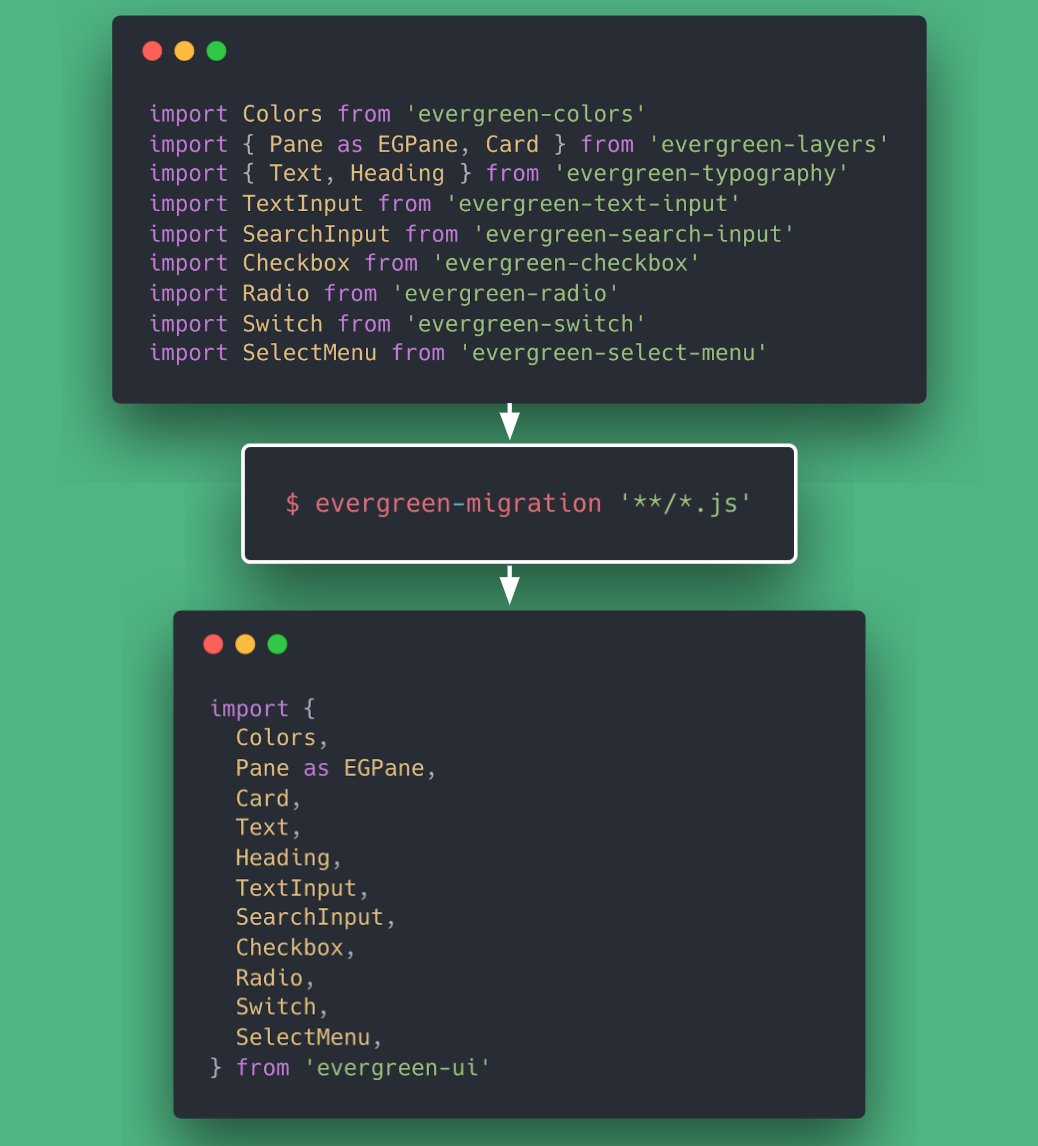
Migrate our codebase in a single command
When we decided to migrate to a single package, it required updating the imports in all the places Evergreen was used in our application. At this point Evergreen was used in over 200 source code files in the Segment application. It seemed like a pretty daunting challenge, not something anyone got excited about doing manually. We started exploring our options and ways to automate the process, and to our surprise it was easier than we thought.
Babel parser to the rescue
We created a command line tool for our application that could migrate the hundreds of files of source code using Evergreen with one command. The syntax was transformed using a tool called b. Now it’s a much better experience for our developers in the application. In the end, our developers were happy.
Lesson Learned, Face the challenge
A big change like this can feel intimidating, and give you second doubts. Although I wish I started Evergreen with the architecture it has right now — sometimes the right choice isn’t clear up front. The most important thing is to learn and move forward.
Driving adoption of a design system is very challenging. It is hard to understand progress. We came up with a quite nifty way to visualize the adoption in our application — and in turn make data-driven decisions about the future of Evergreen.
How to get to 100% adoption
Within our company, product teams operate on key metrics to get resources and show they are being successful to the rest of the company. One of the key metrics for Evergreen is 100% adoption in our application. What does 100% even mean? And how can we report on this progress?
What does 100% adoption even mean?
100% adoption at Segment means building any new products with Evergreen and deprecating our legacy UI components in favor of Evergreen components. The first part is the easiest as most teams are already using Evergreen to build new products. The second part is harder. How do we migrate all of our legacy UI components to Evergreen components?
What legacy UI components are in our app?
Active code bases will accrue a large number of components over time. In our case this comes in the form of legacy component libraries that live in the application codebase.
In our case it comes in the following two legacy libraries:
-
React UI Library, precursor to Evergreen.
-
Legacy UI folder, literally a folder called
uiin our codebase that holds some very old components.
Evergreen versions
In addition to the legacy libraries, the application is able to leverage multiple versions of Evergreen. This allows gradual data migration from one version to another.
-
Evergreen v4, the latest and greatest version of Evergreen. We want 100% of this.
-
Evergreen v3, previous version of Evergreen. We are actively working on migrating this over to
v4.
How can we report on the progress of adoption?
The solution we came up with to report on the adoption of Evergreen is an adoption dashboard. At any single point in time the dashboard shows the following metrics:
-
Global Adoption, the current global state of adoption
-
Adoption Week Over Week, the usage of Evergreen (and other libraries) week over week
-
Component Usage, a treemap of each component sorted by framework. Each square is sized by how many times the component is imported in our codebase.
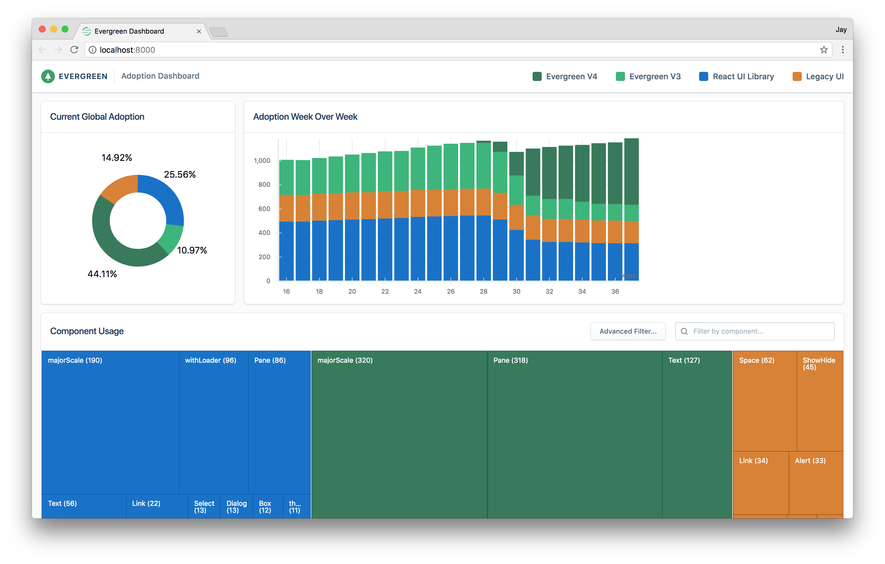
The Component Usage Treemap
Besides the aggregates, we know exactly which files import a component. To visualize this, a Treemap chart on the dashboard shows each component with the size of the square representing how many times it imported in our application.
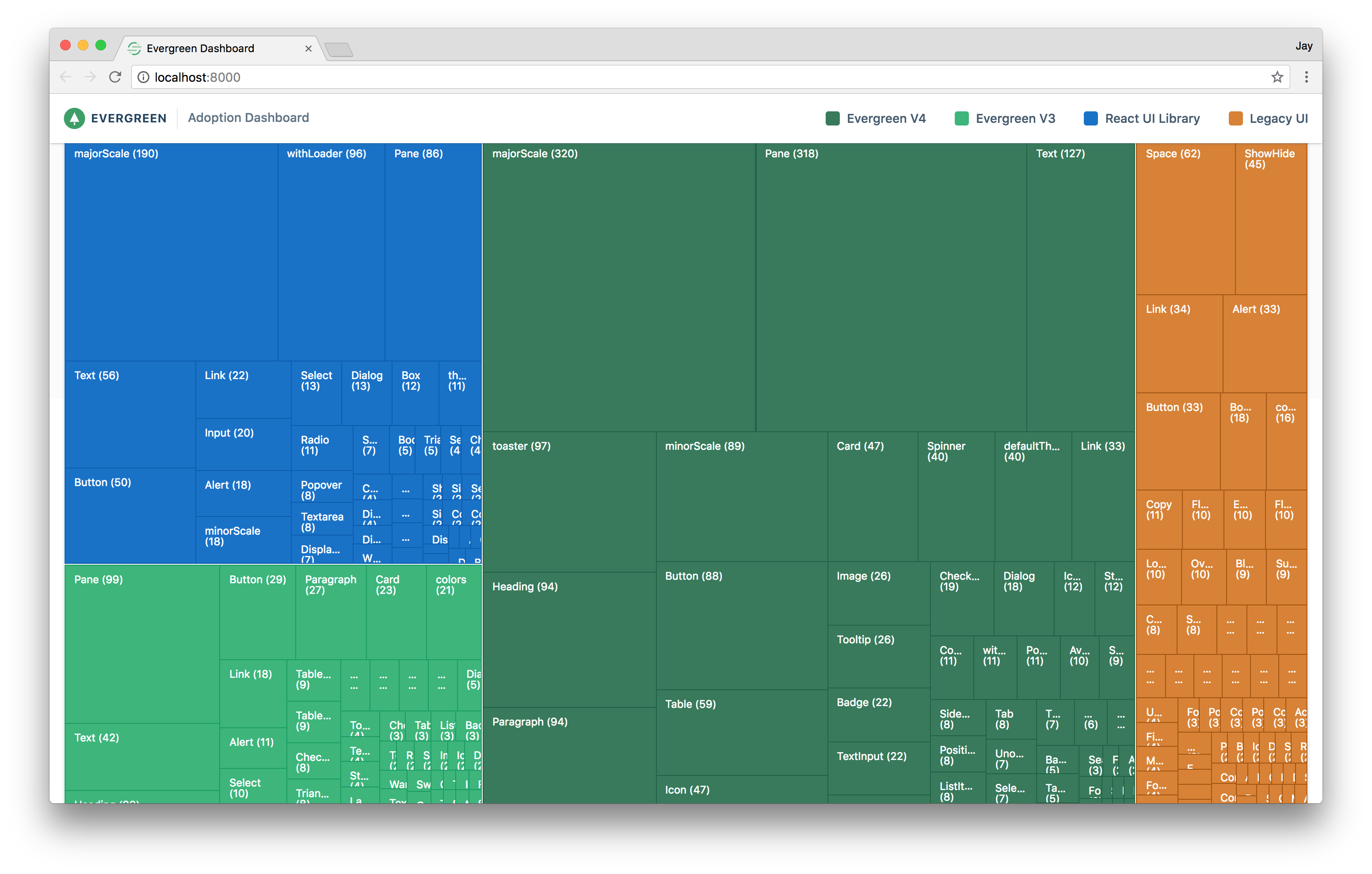
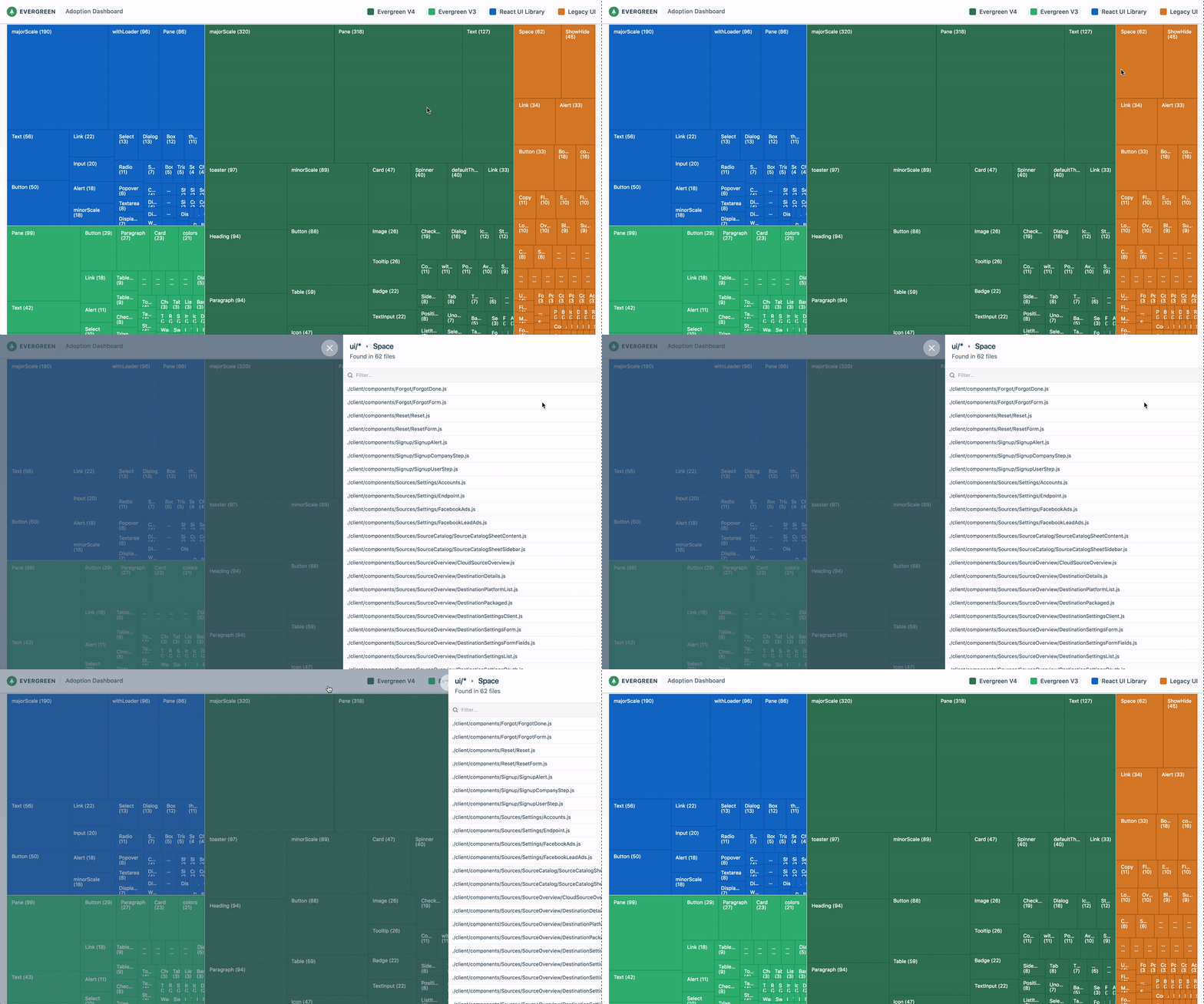
Understand exactly where you are using a component
Clicking on one of the squares in the treemap shows a side sheet with a list of all the files which import that component. This information allows us to confidently deprecate components.
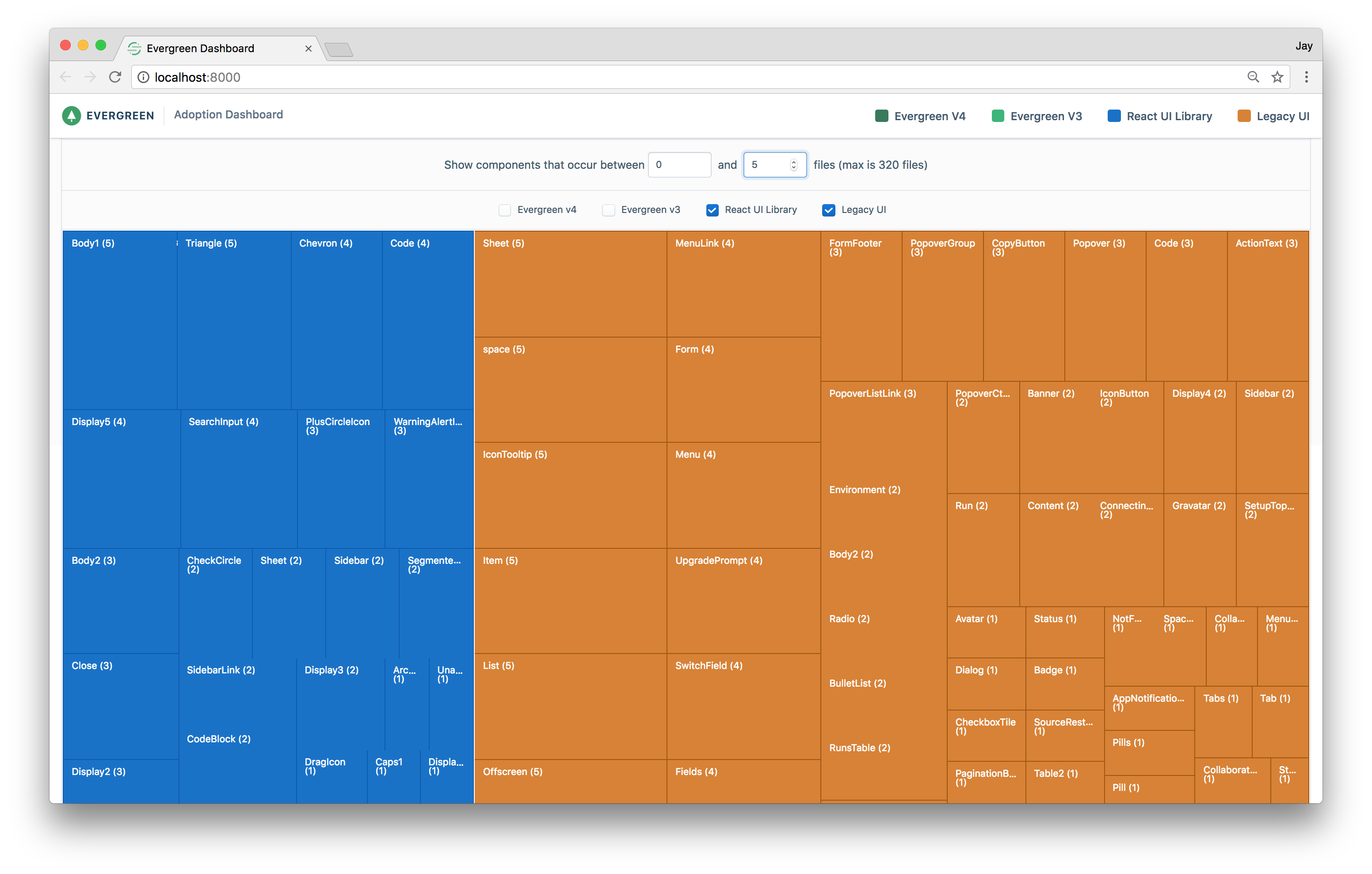
Filter down a list of low hanging fruit to deprecate
The adoption dashboard also helps to prioritize the adoption roadmap. For example, legacy components that are only imported once or twice are easy to deprecate.
How it works
Earlier I shared how we used babel-parser to migrate to the new import structure. Being true to our roots, we realized the same technique could be used to collect analytics for our design system! To get to the final adoption dashboard there are a few steps involved.
Step 1. Create a report by analyzing the codebase
We wrote a command line utility that returns a report by analyzing the import statements at the top of each file in our codebase. An index is built that maps these files to their dependencies. Then the index can be queried by package and optionally the export. Here is an example:
Command
Output
We open-sourced this tool if you are interested in learning more or want to build out your own adoption dashboard see https://github.com/segmentio/dependency-report
Step 2. Create and save a report on every app deploy
-
Every time we deploy our application, the codebase is analyzed and a JSON report is generated using the
dependency-reporttool. -
Once the report is generated, it is persisted to object storage (S3).
-
After persisting the report, a webhook triggers the rebuild of our dashboard via the Gatsby static site generator.
Step 3. Build the dashboard and load the data
To reduce the number of reports on the dashboard, the generator only retrieves the most current report as well as a sample report from each previous week. The latest report is used to show the current state. The reports of the previous weeks are used to calculate an aggregate for the week over week adoption chart.
How the adoption dashboard is pushing Evergreen forward
The adoption dashboard was the final piece in making Evergreen a success as it helped us migrate over old parts of our app systematically and with full confidence. It was easy to identify usage of legacy components in the codebase and know when it was safe to deprecate them. Our developers were also excited to see a visual representation of the progress. These days it helps us make data-driven decisions about the future of Evergreen and prioritize our roadmap. And honestly, it is pretty cool.
Conclusion
To those of you who are considering setting out on this journey, I’ll leave you with a few closing thoughts:
-
Start small. It’s important to show the value of a potential design system by solving a small problem first.
-
Find a real place to start. A design system doesn’t have value by itself. It only works when applied to a real problem.
-
Drive adoption and measure your progress. The real work starts once the adoption begins. Don’t forget that the real value is in adoption. Design systems are only valuable once they are fully integrated into the team’s workflow.
This is only the start of our journey. There are still many challenges ahead. Remember, building a design system is not about reaching a single point in time. It’s an ongoing process of learning, building, evangelizing and driving adoption in your organization.

The State of Personalization 2023
Our annual look at how attitudes, preferences, and experiences with personalization have evolved over the past year.