A new look and feel for the Twilio Segment App
Segment has updated the its app UI to make sure our customers find each and every workflow simple, elegant, and intuitive.
By Hareem Mannan
Segment has updated the its app UI to make sure our customers find each and every workflow simple, elegant, and intuitive.
Today, we’re so excited to share a new look and feel for the Segment app.

This has been a long time coming. Over a year ago, Ilya Volodarsky, one of Segment’s co-founders, and the design team set out to completely reimagine the Segment brand. The results were better than we could have expected. Outside of the new, crisp designs that we felt better aligned with the kind of company and product we saw ourselves as, we were also able to sharpen our cohesive understanding of how these products worked together to give our customers a world-class customer data platform.
Something started happening pretty immediately after we did that. We noticed that when users went from the public site to the Segment app, they were met with a very different experience—one that felt outdated and divorced from the Segment brand.
After talking to customers, we also found that our UI wasn’t meeting some of their expectations, too. There were areas of the product that weren’t just complex—which is inevitable for a tool as technical as Segment—they were complicated. And, while we have a talented design team that prided itself on building intuitive user experiences for our customers, the tools we were using to do so were limiting our options. Most importantly, we wanted to ensure that:
our customers had a unified experience from the moment they signed up for Segment
that they continued to find all of Segment's workflows simple, elegant, and intuitive throughout.
It was time for a change.
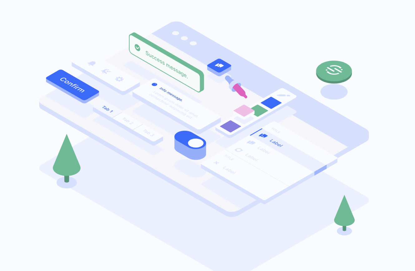
We started off by taking a close look at our design system, Evergreen. A design system is essentially a collection of reusable components that allow designers and developers alike to develop products with consistency and quality. And ours was great—Evergreen has served us incredibly well over the past few years. First created by Jay Ransjin, it quickly rose the ranks of Github with 10K+ stars and 7K+ weekly downloads on NPM. It also became a beacon for amazingly talented product engineers and designers to join Segment.
The multitude of atomic components contained within Evergreen helped us create all kinds of new and interesting patterns. As Segment grew and scaled beyond our primary use case (finding PMF two more times with new products—Protocols and Personas), we started getting…really creative with the components Evergreen included.
Now, don’t get me wrong, getting creative with design system components is great. What was not so great, though, was that these new interpretations led to inconsistent experiences in the app. Think of it like the show Chopped (a guilty pleasure of mine), where each person is given the same ingredients but comes up with something extremely different. This was happening across the board with the way designers built experiences across the Segment App.
Add the fact that we were hiring, and with every new designer came a new interpretation for how to use a specific component, and the problem was only exacerbated. We knew it was time to invest in a consistent brand experience for Segment customers and re-lay the groundwork for future design iterations and product experiences.
This process took upwards of a year and was a massive team effort spanning our design and engineering teams, with insight and guidance from our leadership, product, and go-to-market teams.
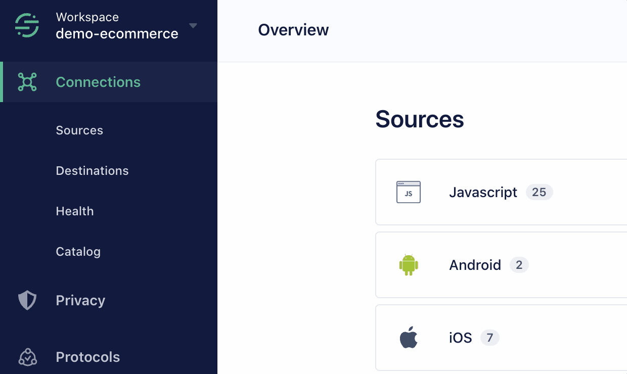
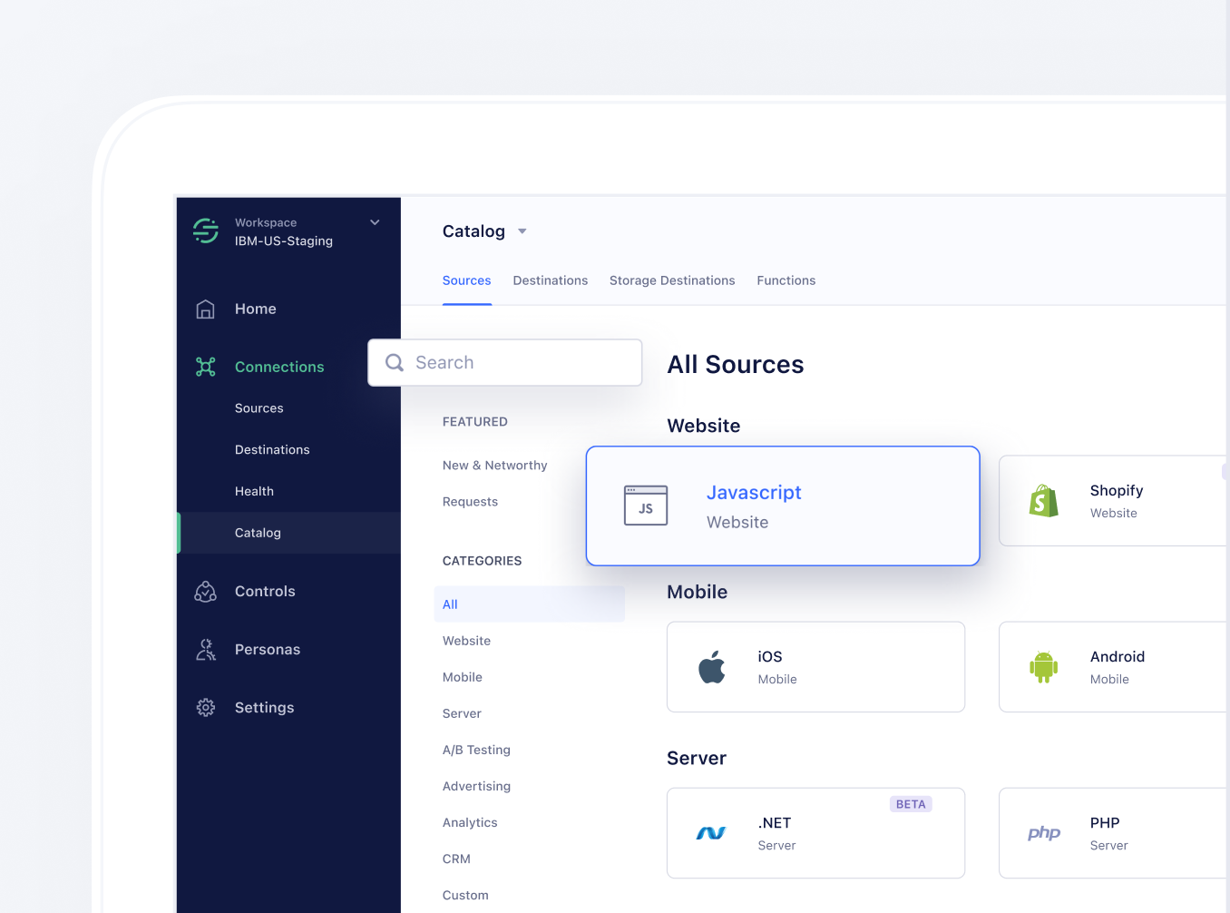
We started off by looking carefully at the ways our customers would navigate through the Segment App. We learned a ton about the mental models with which they thought about navigating through our product. As a result, we re-organized the navigation to better reflect that.
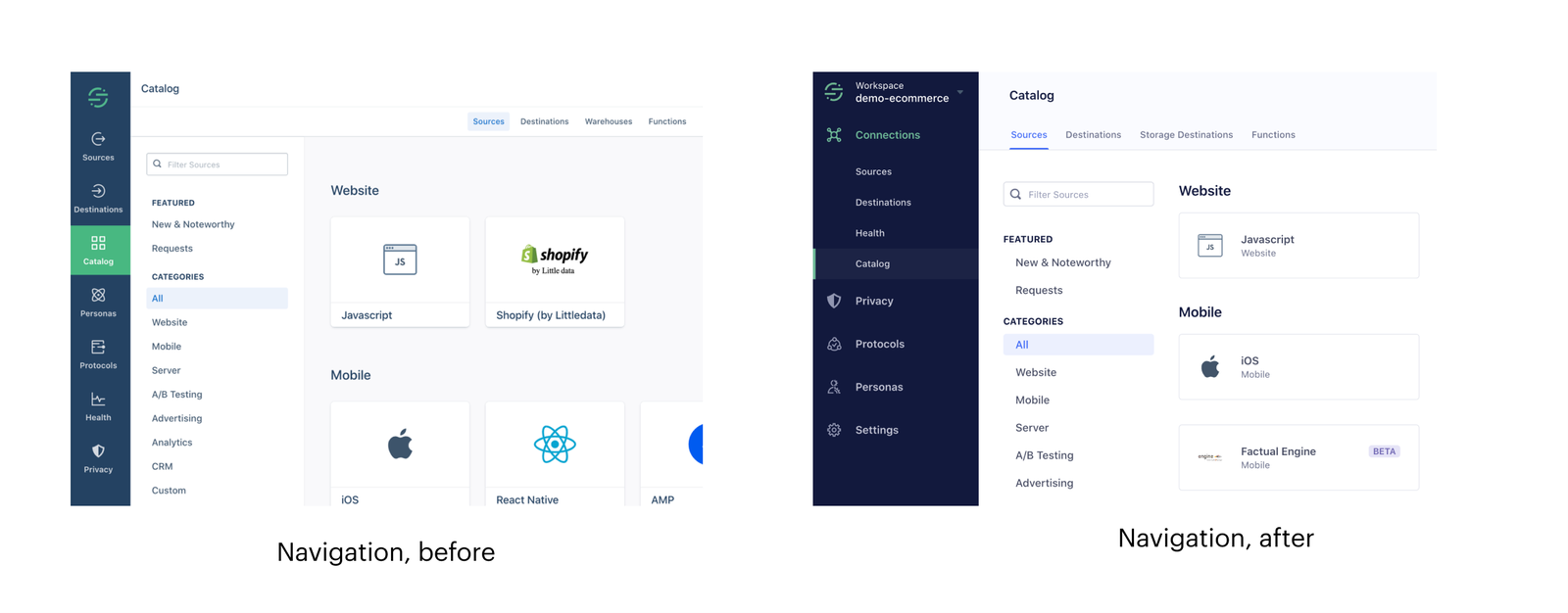
We also learned that many Segment customers operate out of multiple workspaces and needed a simple way to navigate between them. The current process was tedious, so we built a workspace switcher to help customers better navigate between workspaces.
But, what’s most exciting about this re-brand is the way it will allow the Segment team to iterate more quickly in the future (these future iterations are being dreamed up by our team right this second!). By equipping our designers and developers with this set of “fresh ingredients,” we’re able to craft better, more nuanced, and more elegant solutions to the challenges our customers face.
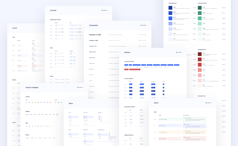
Today is the culmination of a full year of zooming in to the smallest details, like the exact shade of blue that marries both our brand guidelines and accessibility, and zooming out to entire page layouts across a suite of sub-products and a variety of product experiences. We’re so proud and excited to share this experience with you, not as the end of our journey with Evergreen v6 — but as the very beginning of it.
Up next, we’re updating all of our Evergreen documentation so that you can leverage the patterns and open source library we’ve developed. We’ll also be sharing more thought leadership content on all the things we’ve learned from this experience and ways to think about designing for B2B SaaS at scale.
Allen Kleiner, our Design Systems Engineer, details the engineering workflow in a blog post that we’ll be sharing in the coming days. It outlines how he enhanced our existing design system while also reimagining the engineering workflows to scale beyond a one-man machine.
Kate Hsiao, a Product Design Lead and talented design systems evangelist, led the design workflow. One of the key things she did was anchor the re-design in a set of priorities guided entirely by the pain points our customers and team had with the existing framework. She’ll be sharing more around her thinking and process in actually seeing this through to implementation soon.
But, enough from me, I’m excited for you to see and experience the new design for yourself! We hope you enjoy the changes we made and can’t wait to hear what you think.

Our annual look at how attitudes, preferences, and experiences with personalization have evolved over the past year.