Niffy: perceptual diffing to catch invisible bugs
Running QA tests for Segment’s UI was taking way too long. Sure, we had strong component-level tests for our UI kit. But to test our whole app we needed to painstakingly poke around looking for oddities.
Manual testing like this is extremely time-consuming, and you can easily miss accidental, small visual differences that degrade the user experience. Shipping even the smallest of these bugs to production then creates an even costlier bug reporting cycle that involves customers and the support team. That’s no good, we wanted a better way!
So we began experimenting with perceptual diffing. Perceptual diffing compares screenshots of new releases by comparing pixel-values, and then highlights those differences.
This article explains exactly what perceptual diffing looks like and how to set up perceptual diffing easily with Nightmare and Niffy — a new open-source library we’re releasing today.
Below is a real release of Segment’s UI from September 2015. This is a screenshot of our “Workspaces” page on staging (left) and production (right):
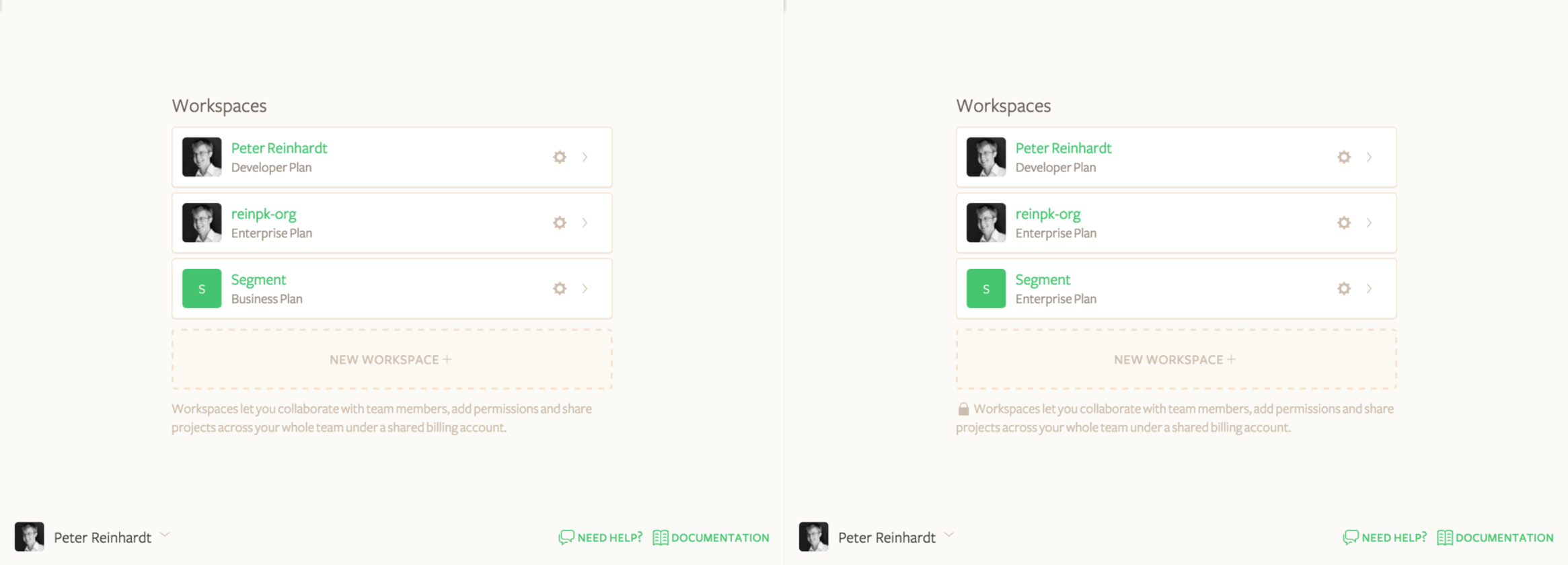
Can you see the regression?
Well, there’s actually two regressions! And I didn’t see either of them when I was testing this manually in 2015.
This is where perceptual diffing comes in: it highlights every pixel change. Here’s what Niffy sees:
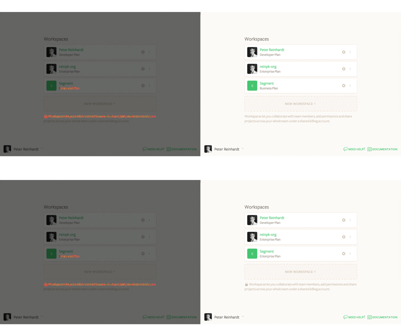
As you can see, perceptual diffing makes both regressions immediately obvious:
The lock icon is missing from the bottom paragraph of text.
The “Enterprise Plan” text under the “Segment” workspace has been replaced with “Business Plan” (broken logic that should standardize the naming).
That said, not all perceptual diffing highlights are regressions. If you ship an update to part of the product, the diffing will go nuts with red highlights. But that’s a good thing! Perceptual diffing really shines by catching bugs on all the other views, where you expect to see zero changes.
When we first heard about perceptual diffing Somewhere on the Internet™, we were quite intrigued. Demos like the one above felt extremely promising for reducing our manual testing burden, and we wanted to get this working for Segment. But as we researched the available tools, they bifurcated into two groups: (1) hosted tools like VisualPing are designed for change detection on public static sites, (2) open source tools like pdiff are aging and also work best on public static sites. The existing tools weren’t the right solution for us because they weren’t able to navigate into our app, click around, and test workflows.
So we decided to build a lightweight perceptual diffing layer on top of Nightmare, our browser automation library. It’s called Niffy and we’ll show you how to use both Nightmare and Niffy below.
Perceptual diffing has three main steps:
Capture screenshots of pages and views in your app.
Diff two sets of screenshots and produce a diff-highlight.
Trigger these capture and diff steps at the appropriate moment in the release process.
Nightmare makes it easy to capture a screenshot. Here’s a fully-functional example:
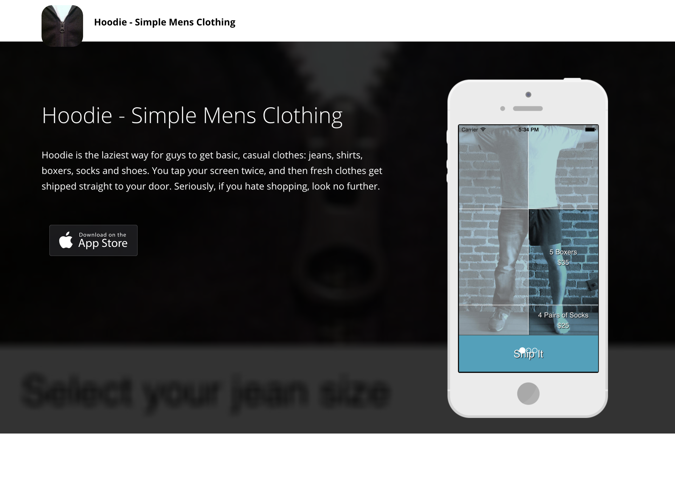
But capturing static urls is not that interesting. Where Nightmare really shines is more complex interactions and app states. For example, you likely want to (1) login, (2) navigate to some part of the app, (3) open up a modal and then take screenshots to make sure core workflows are tested.
Here’s a working example you can copy+paste and run:
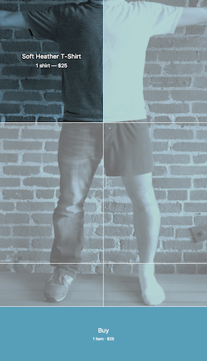
With simple Nightmare scripts like this you’re able to get the UI into complex states and easily capture screenshots.
Once you have matched screenshots of two versions of the same UI, you need a way to generate a highlighted difference. The naive solution is to just take the difference of the pixel values and display that, but this turns out to be unreadable because you just get a giant black image. If you average opacity value instead of taking the difference, you still just get a few randomly colored pixels here and there:

So we dug into other perceptual diffing tools more closely, and then approximately copied what they do: copy over equivalent pixels with partial transparency, and make mismatched pixels red (you can see the exact diffing algorithm we use in Niffy here.
We’ve looked at several different triggers for doing this perceptual diffing. There are a few challenges:
Where do you (reliably) store screenshots of sequential versions?
When exactly is your new release deployed to staging and ready to be diffed?
The answers to these questions are pretty different depending on each company’s cloud provider, continuous integration environment, and deployment process. We’ve found so far that the simplest trigger is to run the diffing manually (make test), comparing staging and production. This is the method we outline next with Niffy.
Niffy is designed to bundle up the capture and diff steps into a library that can be easily used in a mocha test. Niffy exposes the internal Nightmare instance so that you can do arbitrary clicking, typing, checkboxing, etc. before you take your diffing screenshot (see Logged In example below).
Here’s the output of our Niffy tests run at time-of-writing:
All you need to do is run those open /tmp/niffy/… commands to see immediately what broke…
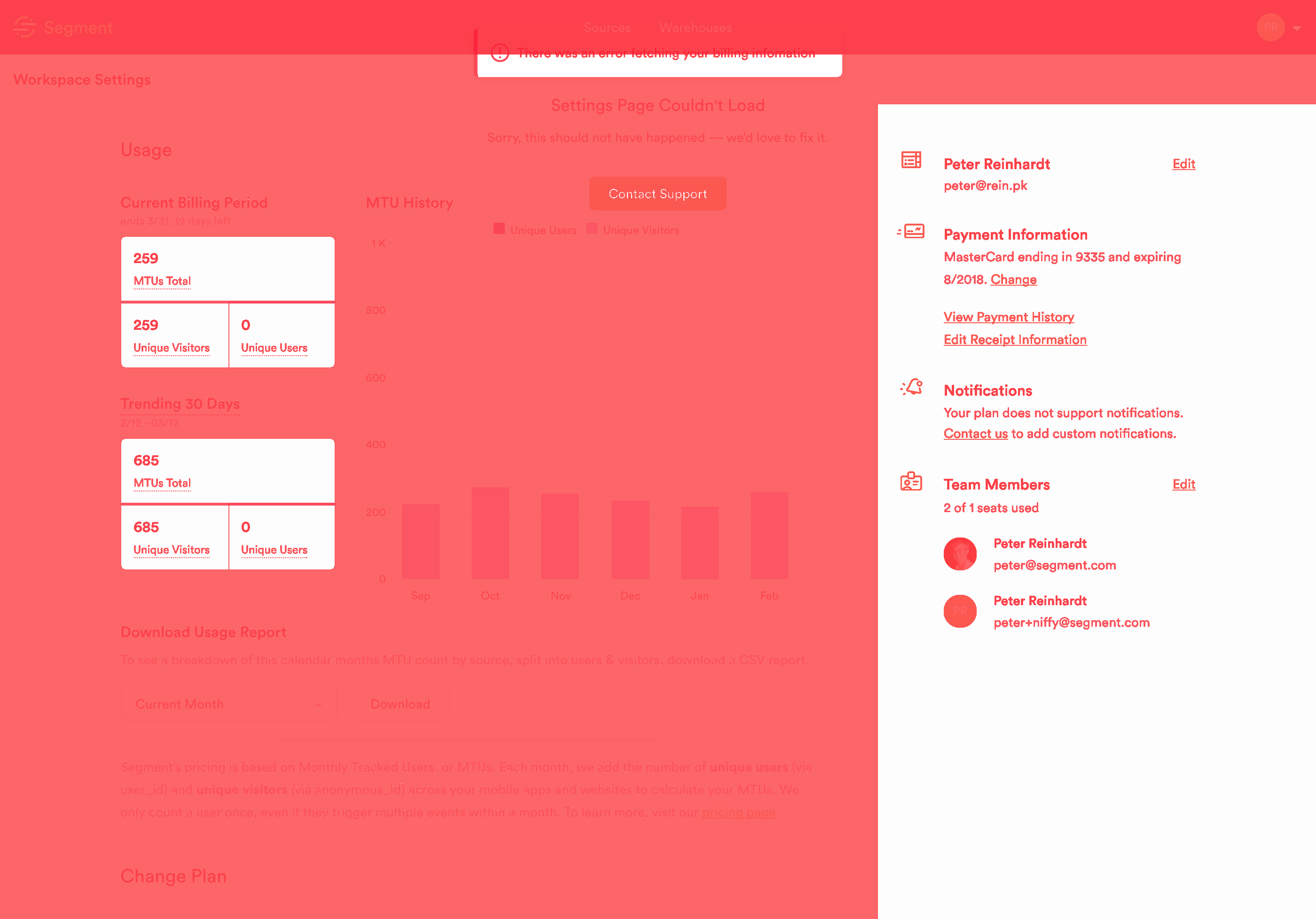
First, it looks like our Settings Overview page got a big update!
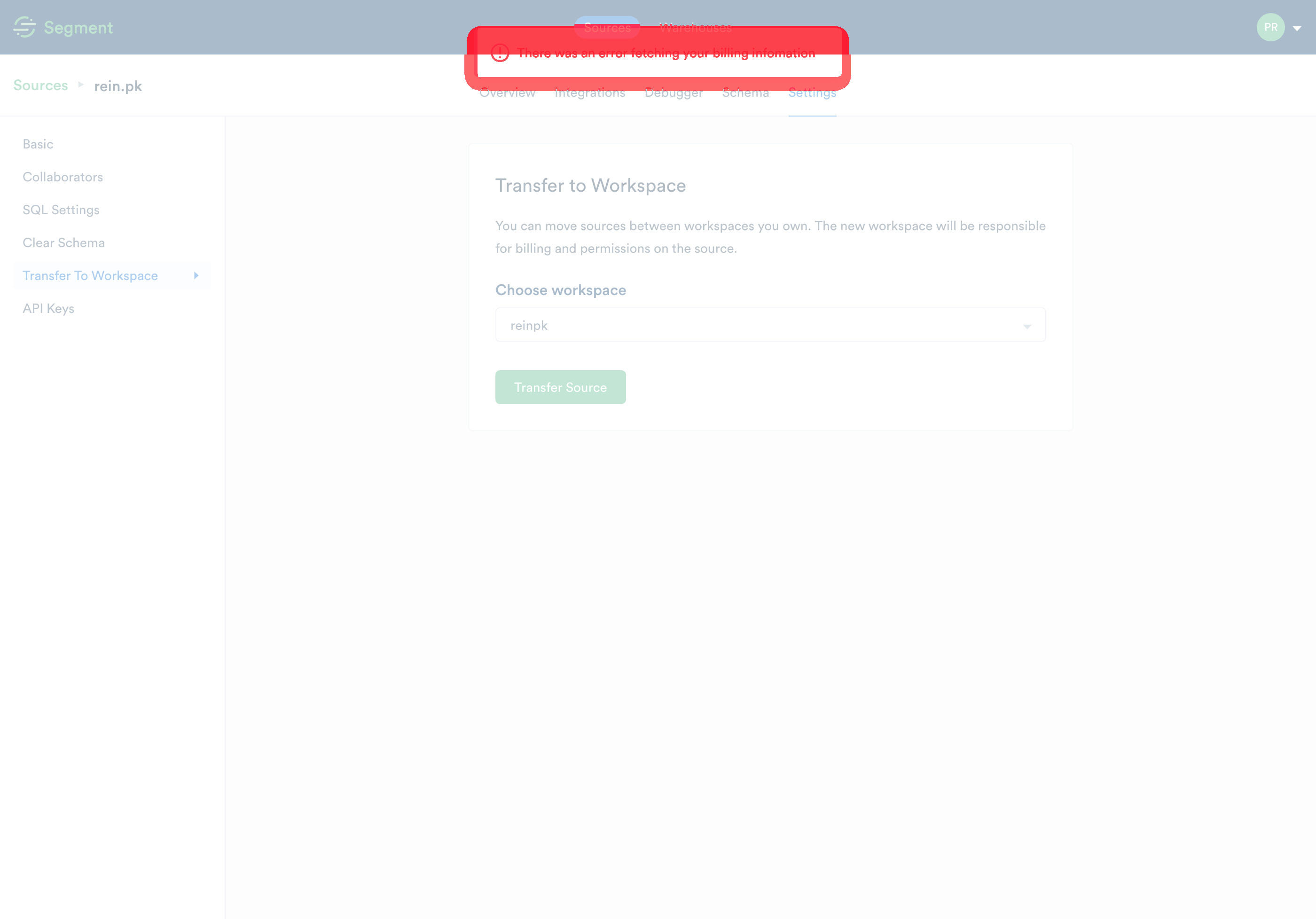
And second, we’re seeing an error alert on staging on the Settings Move Source page that we should fix in our staging environment for better testing:
To help you get started with Niffy, here’s an abbreviated snippet from the diffing test suite (test/index.js) we use on Segment itself (and there’s a ready-made example test suite in the iffy repo that you can run with make test):
With Makefile :
And test/mocha.opts :
And package.json :
To get started with perceptual diffing, head over to the Niffy repo, or use Nightmare directly. And lastly, if you like building software to solve complicated business problems like this, we’re hiring! Or if you’re working on open source full-time, check out our Open Fellowship!

Our annual look at how attitudes, preferences, and experiences with personalization have evolved over the past year.